















Textures of the Sylvain Pinaud Origine
Kwan Ann Tan
What is left behind after colour is stripped down to the essentials? Texture is often seen as the background or complement to overall design, rather than the main feature. But as finishing increasingly takes centre stage, textures create their own intrigue and effects across a watch — manipulating light and transforming hard metal surfaces into velvet softness.


In the case of Sylvain Pinaud’s Origine, texture is achieved through exploring the nature of the material, the craftsmanship required to create it, as well as the overall vision that directs how different textures work together. Ranging from polished, satin, matte, brushed or grained, each bring out a different aspect of the metal that also draws out a different side or character to the Origine.
Material
The properties of each metal play a large part in the textures that can be created. Pinaud describes each type as having their own “personality”, and it’s the innate feeling of each material that influences his approach.
In talking about the nature of each metal, Pinaud describes how they behave: “Platinum has a unique density and a soft, almost silky appearance. It gives the watch a quiet, understated presence. Rose gold is warmer and more expressive, bringing a natural sense of elegance and contrast. Titanium is technically more demanding to machine and finish, but its exceptional lightness and strength give the watch a much more contemporary and almost weightless character.”


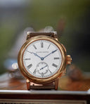
The polish on the case of this rose gold piece invoke sensations of liquid texture.
Crucially, texture cannot be imposed upon the material, it must be carefully negotiated. Pinaud mentions that “the same design can feel warmer, quieter or more technical simply by changing the material, and these feelings inevitably influence the expression of the watch”.
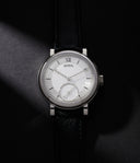
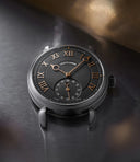
This is evident across the different iterations of the Origine, as the stainless-steel example draws out the stillness and is perhaps one of the most minimalist expressions of the piece, directing the eye entirely to shape and texture. Meanwhile, the rose-gold example invokes a far warmer appearance, with the layered matte and brushed finishing suggesting a gentler, more elegant touch. The deep black of titanium perhaps displays the best interplay with light, with the dark material allowing the shimmer of the matte finishing to really stand out.
The tones of texture
When it comes to texture, especially with a subtler form of finishing like matte, there has to be a balance between colour and effect. Both in terms of material, but also how they interact with the rest of the dial. Pinaud explains, “A matte surface, a brushed surface or another texture can produce a subtly different tone, even when starting from the same colour.”


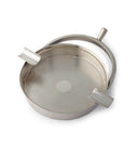
The solution in which the dials are ground against, to create the exact “grain” that Pinaud mentions. Photograph by Neal Fagan.
In terms of the monochromatic palette chosen for the collaboration pieces, Pinaud shows us how they developed the chosen grain found on the dial. “The final color is extremely sensitive to the ‘size’ of the grain,” he says. “Even the slightest variations caused by the human hand when applying the same technique will induce a colour shift. In some cases, we even used slightly different colours on different parts of the same dial, so that the overall result would remain monochromatic while still creating depth, contrast and movement. The challenge was to keep the dial very restrained at first glance, while allowing all these subtle differences to reveal themselves through the light.”
The dial treatment is mainly about finding the right balance between colour and texture. When it comes to the matte chapter ring of the Origine, the process involves a light, wet-blasting across the surface of the metal to create what Pinaud calls a “homogeneous, very fine, peachskin-like texture”. Because the texture produced is so delicate, it risks being overwhelmed by neighbouring forms of finishing. As Pinaud cautions, “Too much, and the surface becomes flat; too little, and the contrast disappears.”


Minute details of the fine matte texture.
Material comes back into play when the overall effect is considered, with minor variations coming together to create the final result.
Vision
“With a limited colour palette, the balance comes mainly from the construction itself,” Pinaud says. “From the very beginning, I think about the different layers, depths and levels of the watch, so that they naturally create shadows and reinforce the contrasts. Nothing is really isolated; every element is considered in relation to the others.”


Light and colour combined.
The challenge that a lack of any colour contrast presented was to consider the dialogue between textures and finishes across the Origine, all while keeping the watch “alive and expressive”
Each of these aspects ultimately enhance what the Origine is, which Pinaud aptly sums up: “For me, none of these materials is better than the other. They simply tell different stories.”
Our thanks to Sylvain Pinaud for exploring the world of textures with us.


