


A Collectors guide to the Patek Philippe Nautilus 3800
By Russell Sheldrake
The story of the original Nautilus, the 3700, has been told a hundred times, from a hundred different points of view. The first steel sports watch to come from Patek Philippe changed the trajectory of the company and in some ways, the industry at large. While the appreciation and collectability of the model has now been cemented, the story of what came next is less prominent. A few years later, in response to the slow start of the original model,
Patek Philippe introduced the mid-size reference 3800. With a reduced diameter of 37.5mm, down from an imposing 42mm, it was meant to bring the Nautilus design to a wider audience. The more palatable size, as well as the wider range of configurations it was available in, made it an appealing alternative.
In more recent times, as the Nautilus has increasingly captivated collectors, collective knowledge about the original model has gained an impressive depth. Principally thanks to the efforts of collectors such as Mstanga, who authored an in-depth guide on the 3700 based on over a decade of research, most of the minutiae of the original has been broken down. Meanwhile, its mid-size relative was often overlooked by collectors, on account of its smaller proportions and perceived lesser significance, compared to the original. For a long time, few had actually had the opportunity, or indeed willingness, to try on the mid-sized reference, long dismissed as a woman’s watch.


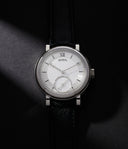
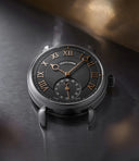
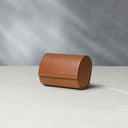
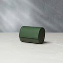
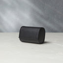
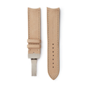
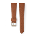
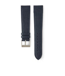
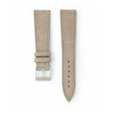
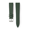
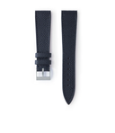
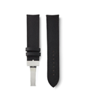
Three examples of the 3800, showing a small sample of the variety that can be found in this reference.
Fortunately, things have changed. More recently, partly due to the growing appeal for all things Nautilus, the 3800 has started to regain prominence. On historical grounds, some have been intrigued by the reference, as the first re-interpretation of the original design with an automatic movement. Others have also begun to convert to the proportions, with collectors turning to more modestly sized pieces generally or realising that it wears similar to long-appreciated vintage watches, such as the Daytona.
Despite resurgent interest, much of the information on the reference has remained fractured. As such, we thought it worthwhile to create a Collector’s Guide on the Nautilus 3800, based on our own experience handling these pieces, researching publicly-known examples and leveraging the knowledge of collectors and experts.
Setting the Scene
From the early ‘80s onwards, the Nautilus collection was built on three, fundamental pillars: the original 3700, the mid-size 3800 and the quartz-powered 4700. The latter was the first evolution of the Nautilus to be introduced, a year before the 3800. Measuring 27mm in diameter and powered by a quartz movement, it was purely targeted at women. Meanwhile, the 3800 was meant to bring the Nautilus design penned by Gerald Genta to a wider audience, who at the time preferred more modestly-sized pieces.
Available in a much wider range of metals and dial configurations than the other two models, it became the anchor of the Nautilus collection for quite a few years. John Nagayama, a veteran watch dealer from Japan, who has had the opportunity to handle some of the rarest 3800 examples out there, speculates that “they wanted to sell the reference to younger generations, as a sports and casual watch.”


The 3700, 3800 and 4700 as they were shown in the Patek Philippe catalogue from October, 1982. Courtesy of Wulf Schütz.
Originally introduced in 1981, the 3800 was only available to clients from the following year. Wulf Schütz, founder of the Swiss vintage watch dealership Rare & Fine Vintage Watches, shared with us archival Patek Philippe price lists from the period. While a price list from September 1981 does not feature the 3800, it does appear from 1982 onwards.
A 1982 price list from Germany shows a few interesting details. Firstly, rather surprisingly, a 3800 in steel was actually more expensive than a steel 3700. Indeed, the price of a Jumbo 3700/11A was 7,100DM ($2,840), whereas the price of the 3800/1 A was 7,500DM ($3,000). Though it is unclear exactly why, Schütz speculates that this price difference may have been due to the fact that the 3800 integrated a centre second or that it was a newly introduced model. This seems rather surprising today, when the market value of a 3700 is several multiples of that of a 3800.
Secondly, the retail price for the different configurations of the 3800, and how they relate to current market value, are also interesting to note. As mentioned, the 3800/1A (with A standing for “acier”, which is French for steel) was 7,500DM ($3,000). By comparison, the 3800/1J (with the J standing for “jaune”, which is French for yellow, referring to yellow gold) was 29,950DM ($11,980). In contrast, a two-tone example, known as the 3800/1AJ, was priced at 15,150DM ($6,060). Quite logically, gold was the most expensive, with two-tone being about half as expensive, and steel also being half as expensive as two-tone. The cost of materials, as well as the perceived value of gold, would no doubt have driven this rationale.


The price list showing the difference between a 3700 and 3800 when they were both on the market in October, 1982. Courtesy of Wulf Schütz.
Fast-forward to today and it’s interesting to see how the market at large perceives the value of each variation. Currently, with stainless steel being prized for its versatility and having become almost synonymous with the Nautilus, the gap between steel and yellow gold examples is relatively small, though the latter still commands a growing premium. Over time, the steel example is the one which appears to most significantly have eclipsed its original retail price, with examples in yellow gold, white gold and platinum only recently having regained a level proximate to their original price, after long being ignored. By comparison, the two-tone examples are almost half the value of the steel pieces, with mixed metal generally having gone out of fashion over the past decade. Though these are subject to change as the market evolves, looking back on an initial price list from 1982 provides some intriguing insights.
Trying to assess the future collectability of the reference is also an interesting and evolving challenge. According to Schütz, where collectors previously considered the 3800 too small, at times without handling the watch in person, their appreciation is shifting. As he puts it, “when you look at images where it’s scaled next to a 3700, you realise it’s not that small of a watch. It’s not that different from a vintage Daytona, though may appear so on account of its smaller dial and thinner case.” When comparing it to the 3700, Schütz also notes that the 3800 may be interesting from a collector’s point of view because of the variety of configurations, from metals, to dials and date discs. Indeed, whereas the 3700 has less variety in its design – which is part of the appeal for some – one could solely focus on the mid-size alternative.
Breaking Down the Reference
Typically, one of first steps taken by those hoping to understand a reference is to try and break it down into different generations. From case design to dial signatures and date discs, these small shifts can signify a change in the production process, which can sometimes be tracked in a chronological manner. A prime example of this is the way in which the Nautilus 3700 has been categorised into successive series by Mstanga, with minute variations along the way.


A page from the Patek Philippe sales catalogue from 1999, showing some of the options available for yellow gold models, courtesy of John Nagayama.
However, based on our own research and experience, the Nautilus 3800 does not lend itself to a similar exercise of categorisation. While there are certainly some distinct differences to be observed, and some can be inferred to come early or late in the life cycle of the reference, matters tend to be more fluid. There are very few clear boundaries of when one feature, such as a black date disc, for example, was introduced and then replaced. Part of the reason for this could be that, during this time period, Patek Philippe started producing components in relatively large batches. This would inevitably mean that parts produced at different times could be gathered into a single watch, creating a variety of configurations. As Nagayama put it on a specific area of interest, “the dials do not have any generations, but variations.”
That being said, there are certainly some interesting trends and details to be observed, which we will break down in relative depth. As always, though we have collected as many insights as we can, there will inevitably be the potential for added nuance. As such, should you have any information that would help us build on the below, please do share. With that in mind, let’s dig in.
The Dial


A small sample of the dial variation in the 3800 range.
The Nautilus 3800 was available with a range of dials. According to John Reardon, former Head of Watches at Christie’s and an expert on all things Patek Philippe, these dials were made by Stern Creations, who also produced dials for the 3700. There were over twenty different dial options available in all case colours. However, four different main options were available for the steel version: dark blue with baton markers, white with baton markers, charcoal grey with Arabic numerals and black with applied roman numerals.
Other variants were also available, but our understanding is that these were the main ones offered in the catalogues at the time. This greater variety in dial types, when compared to the 3700, suggests to us that the 3800 represented Patek Philippe’s attempt to bring the Nautilus design to a wider audience, by offering options suited to wider range of tastes.


The blue ridged dials comes in a variety of different shades, with varying darkness and tone.
The most common and recognisable variant is, of course, the dark blue ribbed dial of the original Nautilus. However, far from being uniform, you can find multiple shades out there, from a dark navy to a lighter blue, with hints of green in between. This variation is a result of changes in the production process throughout the lifecycle of the reference, ageing over time, or a combination of the two.
The range of colours is interesting, as it mirrors the variety which exists in the 3700. Indeed, original Nautilus dials can go anywhere from black to a light green, depending on the example. According to Mstanga, the light blue or green shades are most commonly associated with dials he has categorised as 'Type 6' and 'Type 7' dials (out of about a dozen). These are known to only exist in watches from a specific period, later in the production period of the 3700/1 and also in the 3700/11, identified through their movement and case numbers. This would suggest that there was something different about the dial production process during this time, which resulted in these distinctive shades. For the 3800, whereas we haven’t been able to link shades of blue to specific periods, it is nevertheless interesting to note that variety also exists.


Two variants of the blue ridged dial, on a stainless steel and yellow gold example.
Rather curiously, most of the Certificates of Origin, which were always printed in French, list these dials as being “noir”, which is French for black, rather than blue. We have also seen this dial colour, albeit with diamond indexes, referred to as “bleu nuit”, which translates to night-time blue. As for the Extracts from the Archives, which are available in both French or English, they typically refer to these as a “black ribbed dial” or, more uncommonly, as an “anthracite ribbed dial”.


Up close with a gold dial 3800/1J.
The use of a golden dial across the 3800 is rather curious. While a gold dial is seldom ever seen in the 3700, it appears with greater frequency in the mid-size version. We have managed to find examples as early as 1983, appearing in both full yellow gold and two-tone models, going all the way through to 1998. Although it could have been used later than this, we were unable to find any examples which had been sold publicly.
In yellow gold models, the yellow gold dial appears rarer than the blue. Though the blue dial has traditionally been the most popular variant, the vintage aesthetic and monochromatic appearance of a 3800/1J with a golden dial means it has recently started appealing to a growing number of collectors.


Not something you see, bar one example, in the 3700, the white dial is more prominent in the 3800.
One of the most prominent examples of the 3700 is one with a white dial, which came up for sale at Sotheby’s in 2015, and is believed to be unique. However, while still rare in the 3800 range, we do see white ridged dials in the standard production from 1990 onwards. The introduction of a new colour to the standard production shows how Patek Philippe was willing to creatively branch out with this model, more so than with the Jumbo. This would carry through into the 5711, before the colour was discontinued.
All of the dial types we’ve covered so far are of the standard ridged variety, which itself has become synonymous with the Nautilus, just as the tapisserie design did for the Royal Oak. However, there are a few exceptions to this, where a more pronounced change in dial texture and design gives a whole new appearance to the watch. As ever, it is these unusual outliers which make digging into a specific model all the more interesting.


The rarely seen radial dial from the 1986 sales catalogue, courtesy of John Nagayama.
The first which we feel is worth drawing attention to, is known by some collectors as an exotic or radial dial. This seldom seen dial features a grey sunburst finish, with minute markers painted in white. Though unusual, it is believed to be correct as it can be found in a Patek Philippe brochure from 1986, housed within a two-tone example in steel and gold.
Typically described on the Extract from the Archives as an “anthracite grey dial” with “white markers”, only a small handful of examples are publicly known, either cased in two-tone or platinum, with the latter believed to be unique. As far as we are aware, it was only watches in these two metals which would have housed a radial dial from new, when they were first delivered from the factory. This is confirmed by Extracts from the Archives, where this original configuration is noted down.


A radial dial housed in a platinum case, sold at Phillips in 2018.
However, it was a frequent occurrence at the time that clients could request to have the dial on their watch updated to a different type, even if they had owned it for a while, which is why the radial dial also appears in other metals. For example, we are aware of several stainless-steel pieces which house this radial dial, that would have been ordered separately from the watch.
The Extracts from the Archives for these pieces typically mention the original dial which was delivered with the watch, with some owners also keeping the receipt from Patek Philippe for the updated dial. In the case of a replacement, the manufacture would almost certainly have kept the original dial after replacing it, hence why most of examples out there with a later radial dial, are not accompanied by the original.


The rare telephone dial.
This grey, sunburst texture was also used in different design, which featured painted Arabic numerals. It has gained the nickname of telephone dial among collectors, on account of the fact that it reminds some of the rotary dials used on old telephones. This dial also found in Patek Philippe catalogues from the period, presented in a stainless-steel case. It is believed that the configuration wasn’t very popular with clients at the time, which is partially why so few exist today.
Seldom seen, these have only ever appeared publicly in stainless steel watches. That being said, we are also aware of one example in platinum which came with a telephone dial and matching hands, as well as a second blue ridged dial with corresponding hands. With both dials and sets of hands mentioned in the Extract from the Archives, it is likely that the watch was originally born with the blue ridged dial, with the telephone dial being a later custom request from Patek Philippe.


A white ceramic dial in a yellow gold case.
However, not all smooth 3800 dials feature this grey, sunburst texture. They were also produced with ceramic dials, a new material which was briefly introduced into the Nautilus line. The ceramic dials are often seen in a white, or off-white colour – in a yellow gold or two-tone case – with yellow gold baton markers. These baton markers differ from others, as they are not filled with lume, but rather have small lume plots at the end of the batons, reminiscent of some Rolex dials. We have also seen ceramic dials appear in stainless steel, platinum and white gold examples, though these typically feature diamond markers instead.


Just some of the diamond dial options available in the 1999 sales catalogue, courtesy of John Nagayama.
Moving even further away from the idea of a sports watch, we find diamond dials. While there were a few diamond-set 3700 examples, these are used more frequently and elaborately on the 3800, especially as we enter the ‘90s. We’ve managed to identify two different types of diamond dials, not counting those that just use diamonds or precious stones as markers.
The first has a slate, gilt centre with three rows of brilliant cut diamonds encircling it, all the way to the edge of the dial. These would often use two brilliant cut precious stones, like rubies or emeralds, punctuating the diamonds as markers. The second type of diamond dial is one where diamonds cover the entirety of the watch face. There is also further variation on these dials, in two main areas. The markers are always with precious stones cut in a baguette shape, though you can find examples where just three stones are used at 12, 6 and 9 o’clock or others where every hour marker is a stone, with the exception of a 3 o’clock, where the date aperture is. The second area of variation is found in the placement of the logo at 12. Often, you will see the signature printed on a plaque that sits amongst the diamonds on the dial. In other cases, the signature is actually printed on the glass and in even fewer examples than this there is no logo at all.


The classically styled Roman numeral dial we handled recently.
The final dial variation we have noticed is the use of Roman numerals as markers. These are most frequently seen on flat, slightly shiny, black dials, with the majority being cased in stainless steel and a few appearing in yellow gold. Some will recognise this style from the 3710, which was introduced in 1998. The earliest example we can find of the 3800 with Roman numerals is from 1996, suggesting the design may have been introduced around the same time. We were also able to uncover a slightly different variation: a white dial with Roman numerals at 12, 6 and 9 o’clock, with the rest of the markers made of thin batons. These were found in two-tone and yellow gold.
Date Disc
The next area of interest is the date disc. There are two different colours of date discs in use throughout the production: a black disk with white numbers, and a white one with black numbers.
From our research, it would appear that black date discs were exclusively used in the early stages of production, with a very small number of white date discs also used from early on. From around 1990 onwards, there is a clear shift, with only white date discs being used, and the black ones seemingly disappearing from circulation.
Whereas some have speculated that white date discs on early watches must be service parts, we think the truth is slightly more complicated. Whereas some certainly could be later replacements, Schütz also shared one of the earliest Patek Philippe catalogues featuring the reference, from October 1982, which clearly shows a 3800/1J with a white date disc. This proves that from the very first year, the reference would have been delivered with a white date disc, even if it appears the black one was more commonly used during the early days.


Black and white date discs.
This signals a clear shift from the 3700 production, where only white date discs were ever used. It is possible that this is the first time Patek Philippe used a black date disc, in order to better suit the sportier style of the Nautilus. Among collectors, the darker date disc has generally come to be more sought after, given the way it effortlessly blends into the design, greater perceived rarity and the fact that it tends to be found on earlier examples.
Another variation worth addressing is the different fonts used on the date disc. Evidence suggests that both a serif and bold font was used, on black and white date discs alike. The serif font appears thinner overall and displays an additional stroke or decorative design on the end of the numbers, appearing distinctively more old-fashioned. There seems to be very little pattern the use, nor is there another feature on the watch that any font runs in parallel with.
Signatures
A feature which has been consistently dissected on watches is the signature at 12 and 6 o’clock. These often help to place examples within the sequence of production, with minute evolutions having been broken down for models such as the Royal Oak 5402 and the Nautilus 3700.


Some variation in the 12 o'clock signature, especially notable due to the thickness and accent on the second'E' of 'GENEVE'.
Let’s begin with the “PATEK PHILIPPE GENEVE” signature at 12 o’clock. One detail which instantly grabs attention is the use, or lack of, an accent above the second “E” in “GENEVE”. We have noticed that dials with the accent are generally much rarer, with the majority of the production not having one. During the 1980s, we find dials both with and without the accent.
However, from about 1990 onwards, all dials appear to no longer feature an accent, with the exception of diamond-set ones. The accent therefore appears to be a feature of the earlier models, for the first 10 years or so of production.


The thicker and thinner font found on 3800 dials.
There is also a shift in the thickness of the font used on this section of the dial, which is a similar to a variation which can be seen on other Patek Philippe references. These changes are small and fairly subtle, and we have been unable to categorise them into distinct types at this stage.
Moving onto the signature at 6 o’clock. Three types of signatures exist: “σ · SWISS · σ”, “σ SWISS σ” and “SWISS”. The word “SWISS” is always used and often flanked by the Greek letter sigma. This is to signify the use of gold on the dial, in the form of applied markers.
This was a rule laid out by l’Association pour la Promotion Industruelle de l’Or (APRIOR), a group of Swiss watchmakers which introduced this symbol as a way to emphasise the use of precious materials and the perceived value of a traditional watch. For obvious reasons, dials which do not have gold on them, such as the radial, telephone or ceramic dial, all feature a “SWISS” signature, with no sigma.


The change in the text at 6 o'clock.
As a generalisation, most high-end watchmakers subscribed to this norm from 1971 to 1995. Demonstrating this wasn’t an exact range, we have seen examples of 3800s that were produced after 1995, which still bear the sigma on the dial, and as late as 2003. This would suggest that Patek Philippe either continued this practice longer than others, or that they produced a large batch of dials before the change of norms, which they continued to use thereafter.
As seen on the 3700, the two sigmas are often separated from the word Swiss by small dots. This appears to be the most commonly used dial, followed by “σ SWISS σ”, with the “SWISS” signature being the least common. Though this may appear like dissecting details for its own sake, there’s a few interesting lessons to be drawn here, which may help when collecting thee watches.
Firstly, it is safe to say that any watch produced prior to 1995 which has gold on the dial – that is to say all ridged dials with applied indexes – should feature one of the two sigma signatures. Any example which has a “SWISS” only signature is likely a service dial (with examples having come up for sale publicly, here and here). However, from around 1995 onwards, the “SWISS” signature is used on most watches leaving the factory. This allows for a fairly straight-forward categorisation of dials in a chronological sequence, with the “SWISS” only dial being phased-in towards the end of production.
Hands


The four main types of hands we see across the production.
Onto the hands. You will most commonly find baton hands with lume, as was the style established at the inception of the Nautilus. Always made out of gold, the colour of the hands will match that of the case. For example, a steel case will often use white gold hands and markers.
We have also observed three other types of hands in use, all of which are dependent on the type of dial. Thin, white, stick hands with no lume can be found on the telephone dials. These have squared-off ends and are paired with the same shape of seconds hand that are found on other models. When Roman numerals are used, we see more elaborate leaf hands. These widen in the middle and then finish at a point, with lume used on both hour and minute hands.
The final type of hands are most commonly found on diamond dials, as well as on the radial ones. These are sword shaped hands, which we’ve noticed in two variations. There is a standard style, that are slightly angled from the middle of each hand, and then some that have a groove down the middle, that is often filled in black. The latter is often seen on full diamond dials where the metal hands might need some help standing-out against the brilliance of the dial.
The seconds hands stay the same shape throughout the production but sees some variation in their colour. They’re also matched to the metal type used for the case, like the minute and hour hands, but occasionally will be painted in black. A notable example is on gold dials – either found in gold cases or two-tone examples – where the whole seconds hand is painted in black, with the exception of the counterweight. On other examples, notably the full diamond dials, the hand is fully blacked out.
Case and Bracelet
As mentioned above, the case of the 3800 was reduced in size from the original Nautilus, to 37.5mm in diameter. It was also slightly thicker, due to the new calibre which incorporated a central seconds hand. Similar to the 3700, it came in a range of metals, with stainless steel being the most common, followed by yellow gold, two-tone (stainless steel and yellow gold), white gold, platinum and the rarest of all, rose gold.
The rose gold pieces are so elusive that most aren’t even aware of their existence. According to Nagayama, who has owned one in the past, only 10 pieces were ever produced and sold at Patek Philippe Genève in 1990. It is worth nothing that, at times, a yellow gold 3800 can appear rose in images. This is partly due to the alloys used at the time, as they were of a much warmer tone than we’re used to today, while a small amount of oxidation can also confuse the colour. The two-tone models were also only ever made in stainless steel and yellow gold, with some confusion arising from the rose hues of yellow gold.


The three most common metal types, yellow god, stainless steel and two-tone.
The 3800 also saw a continuation of the monobloc case design, which was first introduced in the 3700 range. The octagonal bezel and protruding ears are secured by four lateral screws, concealed at 3 and 9 o’clock, which hold the case tightly together. A scaled down version of the original, the case of the 3800 shows some slight differences, such as the ears on either side being more curved in style.
Inside the caseback, there should be a seven-digit serial number, with the last three digits repeated on the inside on the back of one of the ears. The same configuration of numbers can be found on the 3700.


The serial number visible on the inside of the caseback (2818659), with the last three digits matching those found on the back of the ear (659). Courtesy of Henrys auction house.
Providing you have access to a watchmaker, this is relatively straightforward way to ensure both parts of the case match and that nothing has been replaced. Below the seven-digit serial number, there should also be the reference number for the watch (e.g. 3800/1, 3800/5 etc.). A small star is also etched on one of the sides of the mono bloc case, though it is unclear as to exactly why this was done.


The two thicknesses of bracelets.
Though the case design remains the relatively consistent throughout the lifespan of the reference, there is some variation along the way. Notably, there are two different styles of gold bracelets and three successive generations of clasps across all models. For the gold bracelets, the main difference is the thickness of the links.
There is a thick bracelet, which is almost identical to that found on all stainless-steel examples. The thinner bracelet is only ever found on gold models and sits a lot closer to the wrist. Though we can only hypothesise, the rationale behind the thinner gold bracelet will likely have been to reduce the weight of the watch, provide a more elegant profile on the wrist and perhaps even reduce the amount of gold used in manufacturing.


The two types of diamond set bracelets that were available in 1986, courtesy of John Nagayama.
The use of diamonds started to become more prevalent as we enter the ‘90s. As discussed above, they appear more and more on the dial, just as they did on the bezel, case and bracelet. There are different styles of setting used for both the bezel and the bracelet, with varying amount of stones used, from singles rows to completely covered bezels. This is also the first time we see Patek Philippe covering an entire watch in diamonds.
While there are models out there where every visible segment is covered, there are also versions were we only see the centre links of the bracelet being adorned with stones. Again, there appears to be no correlation between when one style was used, compared to another. In the current context, where Patek Philippe produces very few diamond watches and where the idea of “factory-set” stands in stark opposite to aftermarket modifications, these pieces seem increasingly interesting and attractive to collectors.
-


Some details of the monobloc case design of the Nautilus 3800.
-


-


-


Patek Philippe also used three different types of buckles during the production of the 3800. Early on, we see the same style of deployante buckle which was used on the 3700, with two solid blades made out of thin metal (Mark 1). Later in the production run, although the exact year is unclear, the two blades are replaced by thicker pieces of metal, which close thanks to an aperture in the middle of one of the blades (Mark 2). Finally, towards the end of production, the deployante is replaced by a butterfly clasp (Mark 3), which opens in two parts and is similar to that found on the reference 5711.
The safety cover that sits atop Mark 1 and Mark 2 clasps should have a small round coin-like totem, with a raised Calatrava cross on it. This is delicately textured, with a hammered pattern. This is held in place by friction and is often one of the first components to begin to show signs of wear, as it protrudes above the bracelet. Later models with the Mark 3 clasp have the cross etched in, possibly by laser.
Though we are unable to attribute specific years to when the different clasps were used, knowing that they were used sequentially can provide a useful rule of thumb to assess a specific piece. For example, if a watch produced in 1985 features a Mark 3 clasp, one could deduce that it is most likely a later replacement part, rather than the clasp which was born with the watch.


The MK1 and MK2 styles of deployante buckles, with the appropriate signatures one should expect to find.
There is also some variation within the same types of buckles, based on the metal used. For stainless steel examples, the buckle is made in steel, whereas the gold (white, yellow, rose) and platinum examples have a white gold clasp. The white gold clasps are distinguished by a gold marking (“750”) and a small engraved sun.


The raised Calatrava Cross on the buckles.
Movement
It has been suggested by some that the movements used in the 3800 are the best indicator of generations, as there is a clear transition from one to the next. There were two different calibres used throughout the 25-year lifespan of the reference: the 335 SC, then the 330 SC.
The 335 SC was Patek Philippe’s attempt to bring the movement of the Nautilus line in-house, away from the same Jaeger LeCoultre ébauche that their competitors were using. The calibre was first introduced in 1980 and was housed in the very first versions of the 3800, shortly thereafter. The 335 SC was just a touch smaller than its predecessor, coming in at 27mm in diameter, compared with 28m. However, it was slightly thicker too, at 3.45mm compared to 3.05mm of the calibre 28-255 C. This new movement ran at 28,800 A/h with 29 jewels. It didn’t have the Geneva seal, nor did it have a Gyromax balance spring.


The caliber 335SC (left) and caliber 330SC (right).
It is estimated that this first version of the movement was used until 1987, whereby an updated version of the same calibre was introduced, integrating a quick set date. Five years later, in 1992, the calibre was completely replaced by the 330 SC, beginning the third generation. This new calibre came in two successive versions. The first one is known as the 330 134, which managed to qualify for the Geneva Seal, whilst all the other specifications appear to stay the same. This is until 1997, where the 330 194 began production, signalling the start of the fourth and final generation, keeping the Geneva Seal but dropping the oscillations to 21,600 A/h. The first versions of the 330 194 calibre still had 29 jewels, which was later upped to 30.
In summary, there are therefore four main generations of movements, which can be tracked chronologically, with relative accuracy: 335 non-quick set (1981-1987), 335 quick set (1987-1992), 330/134 (1992-1997) and 330/194 (1997-2006).
The Outliers


Beyer and Tiffany-signed examples.
As you’ve likely been able to gather from the above, the variety found in the 3800 forms parts of the appeal of collecting the reference. As ever, the outliers only enhance the appeal. Firstly, you have double-signed examples. This is perhaps the only area where we see greater diversity in the 3700, where a richer number of double-signed dials have appeared, likely on account of the greater prestige of the reference. So far, only four retailers are known to have signed the dial of the mid-size Nautilus: Tiffany & Co, Beyer, Gübelin and the elusive Asprey.


A Certificate of Origin from Tiffany's, courtesy of Wulf Schütz.
From the examples we’ve been able to handle and those which have sold publicly, it would appear that Beyer and Gübelin appear as frequently as each other, with fewer examples having appeared with the Tiffany & Co. signature. Double-signatures also seem to appear most frequently in stainless steel examples, with fewer two-tone or yellow gold examples known. To this day, no white gold, rose gold or platinum examples have appeared with double-signed dials. It also appears that almost all double-signed dials are of the traditional ridged variety, with one exception we’re aware of in a private collection: a white ceramic dial signed by Tiffany & Co. As we discussed in our previous in-depth look at double-signed watches, most of these signatures were likely printed by the retailers themselves, rather than by Patek Philippe or Stern Creations.


A few examples of double signatures.
The most elusive is the Asprey signature, which to this day is only known to have appeared on two examples. Both of them are yellow gold dials, with diamond indexes, paired with a black date disc. One of them, a 3800/1, is cased in a regular yellow gold case, whereas the other is 3800/5, with three rows of diamonds on the bezel and three rows on the centre links. The latter was made in 1984, subsequently sold on 16th July 1985. The former, more restrained in its overall design, is from a similar period, having been made in 1985 and sold in 1986. The rarity of the Asprey signature carries through to the 3700, with only one example being publicly known. A small handful of examples with a Khanjar dial are also known, which were likely signed and sold by Asprey to the Sultan of Oman.


A diamond covered 3800 that used to belong to a Yakuza boss. Originally written about by SJX.
A rather mysterious two-tone example is also known to exist with a blue slate dial, with the initials “HTL” printed at 6 o’clock. Though there is a rumour that these are the initials of a Patek Philippe employee for whom the piece was made, this has never been confirmed. When it comes to provenance, however, there may be an even more intriguing example out there. A 3800/108, with the whole dial and case covered in diamonds, was gifted to Jiro Yanagawa, one of Japan’s most notorious Yakuza bosses. Yanagawa grew the influence of his organised crime syndicate by forging a variety of relationships with high-ranking officials, himself becoming an influential political figure. His Nautilus 3800, which appeared publicly a few years ago, is engraved in Japanese on the caseback with “Gift' and 'Yanagawa Gishi', his other name.
Accompanying Materials
As any collector of vintage and pre-owned will appreciate, sourcing a full set example of a reference can be a priority, not only to secure the provenance of your watch, but also for the added pleasure of gathering all the materials. The box and papers can look quite different from one watch to the next, so it’s useful to know what to expect if you’re looking to track down an example.


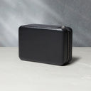
One of the early boxes that stainless steel models came in.
Not all 3800 watches came in the same box, partially due to the long lifespan of the reference, as well as the different metal types. The early steel examples came in one of two boxes. Both were square, red leather boxes with cream interiors, with one having normal corners and the other have cut-off corners. Both of these came with the same outer box, which mimicked the same red colour.
It is unclear exactly when one box ceased to be used and another took over. It is also important to point out that, at the time, things were less codified than they are now. Sometimes, retailers would select any seemingly appropriate Patek Philippe box after selling a watch. For example, we’ve seen one example of a 3800 which was originally sold with an Ellipse-shaped box, which was never intended for the Nautilus range after the very first 3700 examples. This shows that it is possible, though unlikely, that retailers could casually match a box to a watch, following a sale.
While steel models initially came in these red leather boxes to begin with, gold models were almost always accompanied by a wooden box with a golden stripe down the side. These had dark brown cushioned interiors, with the Patek Philippe name printed inside the lid. Later in the production run, we start to see steel models in similar boxes, but without this gold stripe.


Some of the other paperwork which accompanies these watches.
Alongside the box, you should also find a red leather folder for holding documents. This should house a Certificate of Origin, displaying the date of original sale, alongside date-appropriate documents, ranging from marketing materials for unique exhibitions, to information relating to Patek Philippe’s museum. These can vary widely depending on when the watch was sold and are often one of the first things the original buyer would throw out when they got the watch. As is customary, an example can also be accompanied by a later Extract from the Archives.
Parting Thoughts
At the turn of the millennia, after a near two decade run, the reference was discontinued. The steel example is known to appear in catalogues until 2006, with the yellow gold appearing as late as 2007, in parallel to the successor reference, the 5800. From 2008 onwards, it disappears completely from official catalogues. However, this doesn’t mean that you can’t find one that was sold much later, since not all authorised dealers would have sold-out of their watches immediately.
What is certain is that the discontinuation of the reference marked the end of one of the first reinterpretations of the original Nautilus design. First commercialised as a more appealing – and expensive – alternative the Nautilus 3700, the mid-size 3800 has come to exist in all sorts of intriguing configurations over the years. In more recent times, as it has been increasingly discovered by collectors, this appreciation has grown.
In tandem with this growing interest, we hope that that his guide has proven useful and insightful to those looking to collect the reference, or to purely dive into its minutiae. As ever with these things, there will undoubtedly be some nuance that has been missed. If you feel like we missed anything, please feel free to reach out to us over the usual social media channels, in the comments section of this article or via email at enquiries@acollectedman.com. As new information emerges, we hope to continually update this guide.
We would like to thank John Nagayama, Wulf Schütz and John Reardon for giving up their time and knowledge for to help build this article along with providing some incredibly rich contemporary source material such as sales catalogues and price lists.