


A Collector's Guide: Asymmetrical Watches
By Raj Aditya Chaudhuri
The principle of symmetry has been adhered to by watch designers almost religiously for the past 100 years. It is obviously a logical base to build from when constructing a tool aimed at precision. However, in many ways, a wristwatch is quite unlike any other scientific device designed with a singular purpose.
It has always been just as much a lifestyle or fashion piece as well as a practical tool. While there have been sporadic attempts to imagine a visual language that is pared back and strictly functional, some watchmakers and jewellers have tried to break free from the constraints of shapes believed to be ergonomically suited to watchmaking.
One such era of unbridled creativity was the post-war period, leading into the Swinging Sixties and the early 1970s. While this era is marked by the works of jewellers such as Gilbert Albert and Andrew Grima and designers such as Richard Arbib, we posit that there was a wider willingness within watchmaking to experiment with shapes and forms during this period.
The Ground Rules
When speaking about asymmetry, in watches or otherwise, it is helpful to establish what the norm is and the reasons for it. Most modern watches with a crown are not entirely symmetrical in the first place, says Benoît Mintiens, who worked as an industrial designer before founding Ressence, but “most established designers will tell you they design by proportions. A well-designed product is a mixture of an uncountable number of considerations that lead to the final design. Proportions are key to having a product that appeals.”


Watchmaking has long been guided by principles aimed at creating the impression of visual symmetry. Designing elements in proportion to one another is another way watchmakers and designers have sought to create harmonious design.
While guided by principles such as the golden ratio, design by proportions and ergonomics, there is also another social aspect designers have to consider for a wristwatch, “[namely] the social impact of the watch on others”, says Mintiens. “To my astonishment, when I started Ressence I saw people testing a Zero Series by looking [at themselves wearing the watch] in the mirror. This was an eye-opener for me.” This under-studied social component has long been a driver of watch design. Another crucial factor is case integrity, aimed at functions such as its ability to protect the calibre and offer water and dust-resistance.
The Forces of the Day
Just as global conflict had moved the watch from the pocket to the wrist, strong cultural forces of the day would again further the evolution of the wristwatch. Francesca Cartier Brickell, in her book The Cartiers: The Untold Story of the Family Behind the Jewelry Empire, talks about how in the early 1960s the London operation of the famous house started facing pressure from regular clients to design watches that were “unlike any other”. Of course, this desire for newness and exclusivity had come to the fore even before the Swinging Sixties, says Sébastian Vivas, the heritage and museum director at Audemars Piguet.
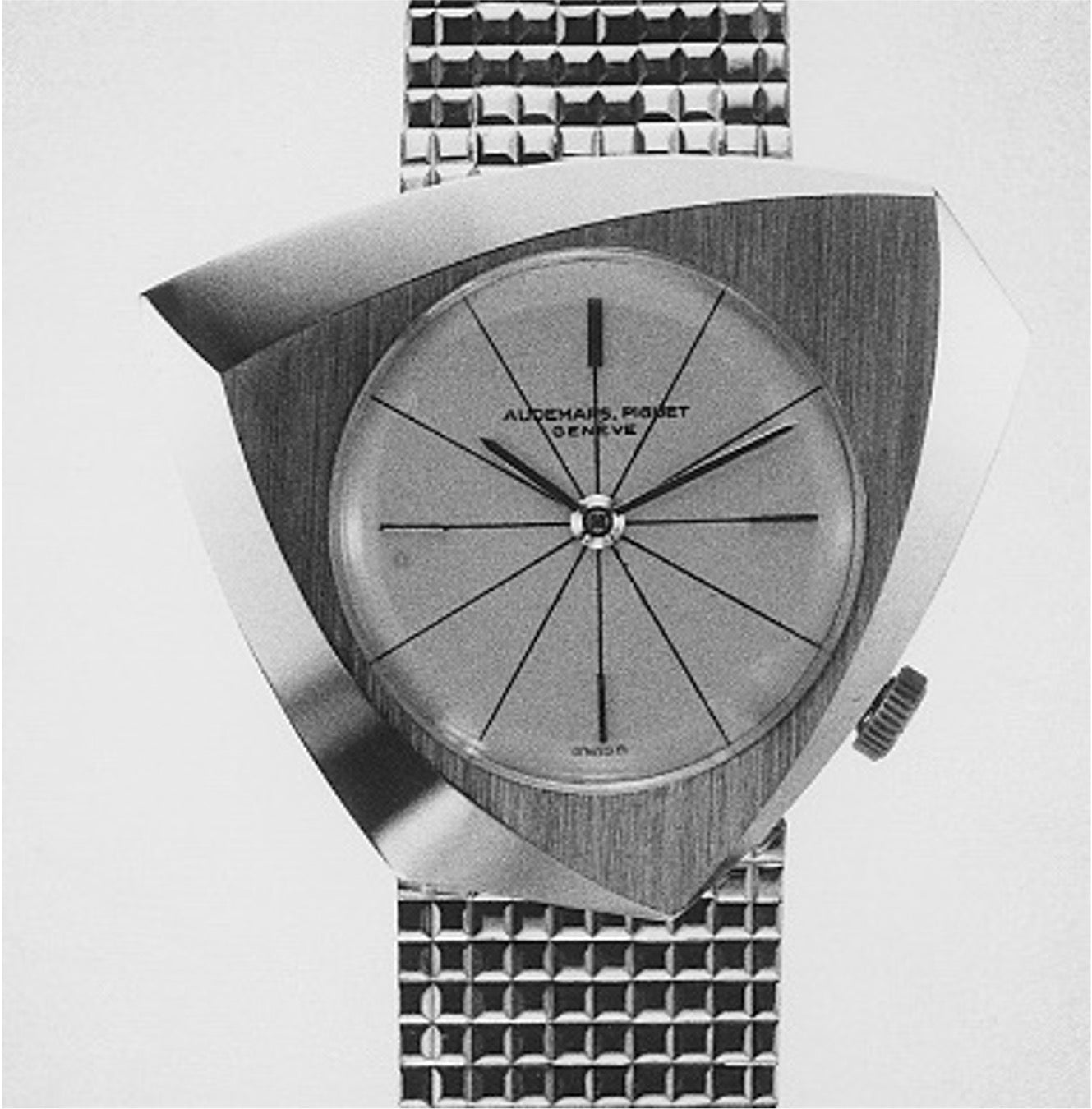
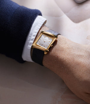
Audemars Piguet, back then a fraction of its current size, had already started experimenting with the form of its watches. This started with bracelet design and eventually made its way to more unusual case shapes. These new forms were an attempt to harmonise the two shapes that had dominated watch design up until then.


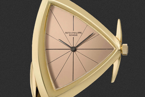
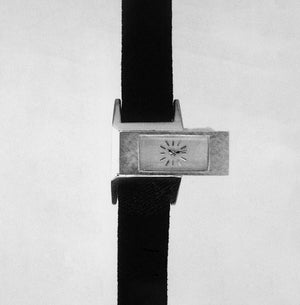
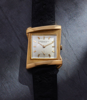
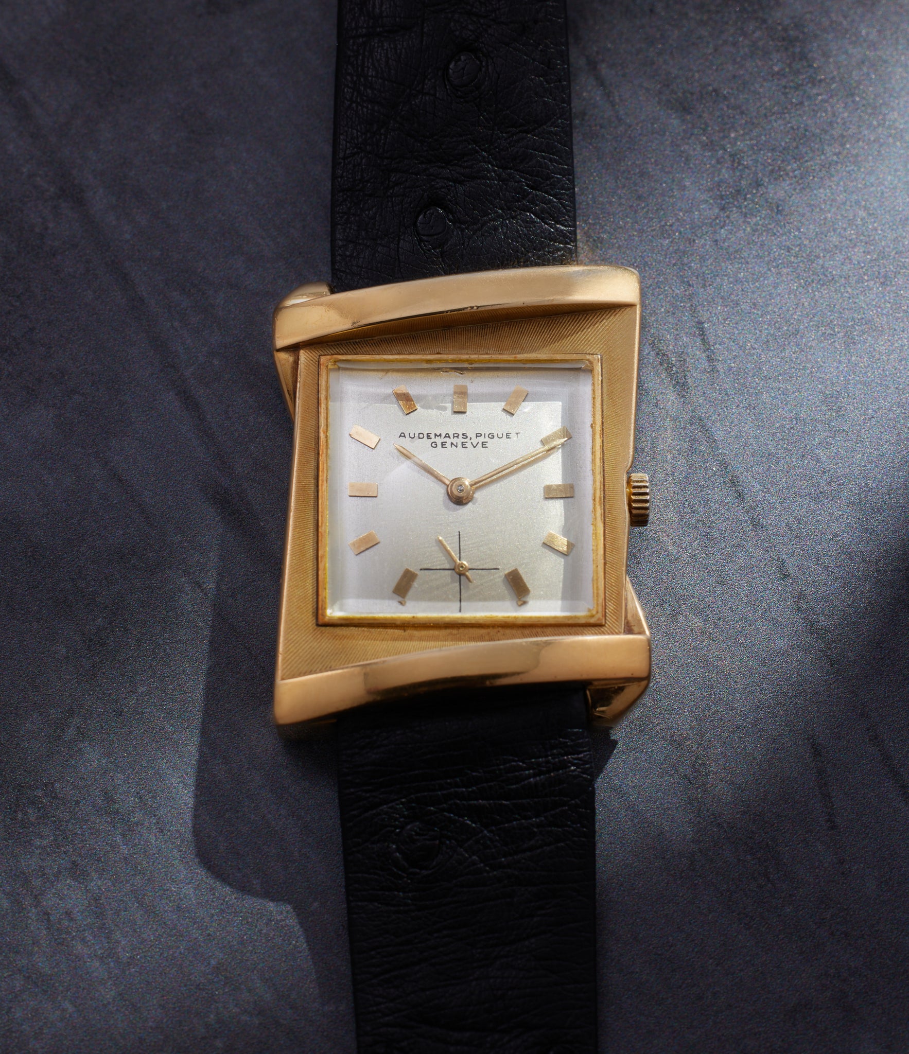
The ref. 5182's asymmetry isn’t just restricted to the case design. The effect is amplified by the way the dial furniture is arranged.
Vivas says, “Pocket watches, owing to the round movements in them, and the circular motion in which the hands move, were almost always round.” Then came the world wars. “The moment you have to add a strap or a bracelet to the case, it is no longer round,” he adds. “The addition of the lugs adds elements of a rectangle or square. These two shapes … don’t work well with a circle. I think it was a desire to make a more harmonious design that saw the rise of wristwatches traditionally in rectangular or square shapes.”
However, by the end of WWII, round-cased wristwatches were in vogue again, says Vivas. “This may be why the casemakers, designers and jewellers of the era started to study different possibilities. The asymmetric-cased watches Audemars Piguet was making around this period was an exercise in reconciling square and rectangular shapes with the circle, and in the process creating something fresh.”
The ref. 5182 is an example of this, as is the complex case of the ref. 1216-5167. The latter’s “twin” reference number dates it to before the 1950s, which was when the brand instituted its new 5XXX range reference nomenclature.
-

In celebration of the brand’s 125th year, Audemars Piguet recreated the ref. 1216-5167 seen here. It was a pièce unique. Courtesy of Audemars Piguet.
-

The ref. 5159 offers another example of the play between symmetry and asymmetry. Courtesy of Audemars Piguet.
-

The trapezoid-shape of the ref. 5175 is also ergonomically suited to wearing on the wrist. It is a shape that continues to find favour over the decades to come, as we will see further in the article. Courtesy of Audemars Piguet.
-

The ref. 5828, with its time-telling elements almost outside the frame of the watch case.


There was an increasing appetite for experimentation evidenced by two truly rare references, the 5828 and 5159. Both played with convention in different ways, toying with the form of a watch case and exactly where the dial should live. The ref. 5159 even required a custom-made crystal to sit inside its odd-shaped case.
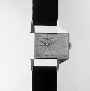
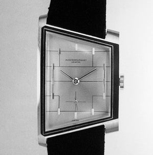
“While the watch becomes functionally suited to daily life, it is also an object of prestige, beauty and fashion,” says Vivas. “That tussle resulted in some of these watches.” Examples like the ref. 5158 sought to play with our expectation of symmetry along a central vertical axis. While the ref. 5158 is symmetrical along a diagonal axis and it wears much like a rectangular case watch, it still does not meet the eye’s expectation of symmetry, especially in the context of watch design. Produced in 1960, no more than seven pieces of the reference were made. Four of them have since been melted down, says Vivas. It is powered by the 10TS – a small, slim movement made by Louis Elisée Piguet. Most of these references were made in small numbers, while others were unique pieces never replicated again.
External Factors Shaping Watch Design


“While Audemars Piguet started making asymmetric cases that tried to blend form, function, ergonomics, and beauty in the late 1940s and early 1950s, I would say the 1960s was the golden era for asymmetric designs,” says Vivas. As the Jet Age dawned, representatives from traditional watch brands who had travelled to the capitals of the world came back with new ideas and suggestions on the latest trends in fashion and culture.
-
The Audemars Piguet ref. 5158 wears much more like a traditional square or rectangular watch.
-
-


At Patek Philippe, a young new designer with a jeweller’s eye, inspired by the works of artists such as Constantin Brâncuși and Piet Mondrian, was challenging norms. Rising through the ranks, Gilbert Albert was entrusted with the creative department of the traditional watchmaker. His works included references such as the 3422 and the 3424, blending a thoroughly asymmetric case (where even lug widths were different) with the familiarity of a somewhat traditional rectangular dial. Other examples, such as the ref. 3412 and ref. 3270, with their triangular cases, represented a vision of asymmetry pushed much further (the cases were made by Markowski). Albert extended this treatment to the brand’s pocket-watch offering as well, with notable examples such as the ref. 788 – with a two-part case crafted by Antoine Gerlach – and the ref. 789.
-

On the wrist, the ref. 3412, inspired by the works of Brâncuși, is seemingly incomparable to a round-cased 36mm-cased watch. However, both in terms of scale of the dial and the footprint the case occupies on the wrist, it is surprisingly similar. Its triangular shape is masked by sculptural elements on either side of the case.
-
-

-

The 3424’s asymmetry is more pronounced in a way that immediately announces itself when placed on the wrist. The different lug widths are noticeable, as is the tapering dial-side appearance thanks to the left-hand side of the bezel that curves in dramatically. However, it is the sculptural nature of this case which enables it to maintain some degree of wearability. The extended, overhanging lugs, that jut out depending on how the watch is worn on the wrist, serves to give the case an exaggerated visual presence.


This brings us to the next factor that was crucial to both the proliferation and variety in asymmetric cases. This was still a period when most brands sourced cases from specialist makers. Names such as F. Baumgartner, Taubert et Fils, Eggly & Cie, George Croissier, Markowski, Vichet, Wenger and others appeared on supplier rosters of many watchmakers. These specialists, unlike watch brands of the day, were constantly producing a variety of shapes and designs in order to get new business.
Brands recognised this and were open to case designs that these casemakers brought to them. “You may find very similar models from other companies in this era because they were proposed by then casemakers,” says Vivas. His colleague at Audemars Piguet, Raphaël Balestra, adds, “I am quite certain that there is a watch very similar to the ref. 5159 in the Patek Philippe museum, wearing the brand’s signature. This was because both brands bought cases for these watches from Eggly & Cie, a casemaker that used to be based in Geneva.” As with the 5158, only seven examples of the ref. 5159 were ever made.
Despite this overlap, the diversity of case shapes from this period was undoubtedly aided by these specialist case makers. Another factor was the willingness brands had to create a variety of different watches. “In 1951 Audemars Piguet had more than 300 models, most of which were made in fewer than 100 pieces,” says Vivas. In the 1960s, there were even more than this.
Asymmetry at Cartier


By the early 1920s, still premature in the evolution of the watch from the pocket to the wrist, Cartier was experimenting with the form wristwatches could take. One of its earliest attempts was trying to adapt a watch designed as a brooch, for the wrist. The Cloche, as the bell-shaped design would come to be known, was first adapted for the wrist in 1921. It featured a dial turned 90° so 12 o’clock lined up with the crown on top of the “bell”. The opposite side of the case was totally flat, so the wearer could ostensibly take it off their wrist and lay it on their bedstand at the end of the day and it would approximate a clock. However, the case and dial orientation, while unusual in its orientation, still had a semblance of traditional symmetry about it.
While war would provide the crucial impetus that would finally decisively take the watch out of the pocket and onto the wrist, the advent of motorsport in the early 20th century also played a well-documented role. This led to watchmakers rethinking the orientation of watch dials for the ease of time-reading while at the wheel. Eminent collector of vintage watches and author Auro Montanari says, “In the 1920s and 1930s, many brands launched drivers’ watches. The asymmetric case and rotated dial are offset for easier reading while hands are on a steering wheel. If you're a race-car driver, you might not even want to turn your wrist to check the time. It's this specific situation that justifies the somewhat odd-looking but very purposeful design of what's known as a drivers’ watch.”


An early ad of Cartier’s offering, that also includes that also features the familiar shape and Arabic numerals of the Asymétrique. In the ad the watch is simply called a ‘gentleman’s gold wristwatch on a leather strap’. Courtesy of Cartier.
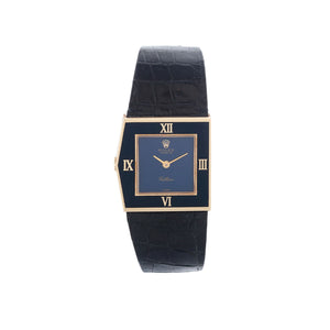
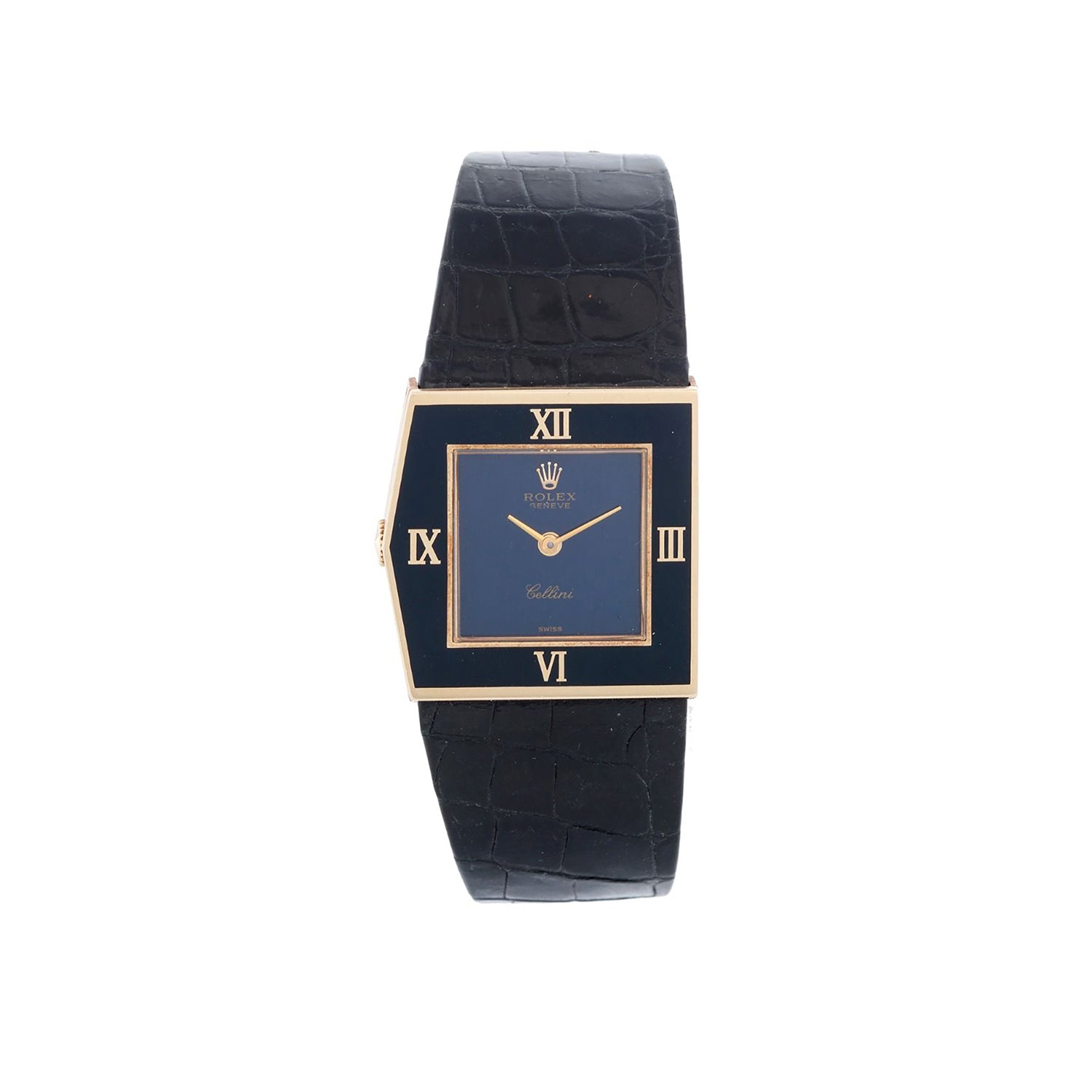
While Vacheron Constantin’s solution was to fit a dial tilted 30 degrees in the American 1921 (so 12 o’clock aligns with the top right corner of the cushion-shaped case), Cartier was to approach the concept a bit differently. After the Cloche in the early 1920s, Louis Cartier followed it up in 1936 with a piece that he called bracelet montre losange, owing to its shape.


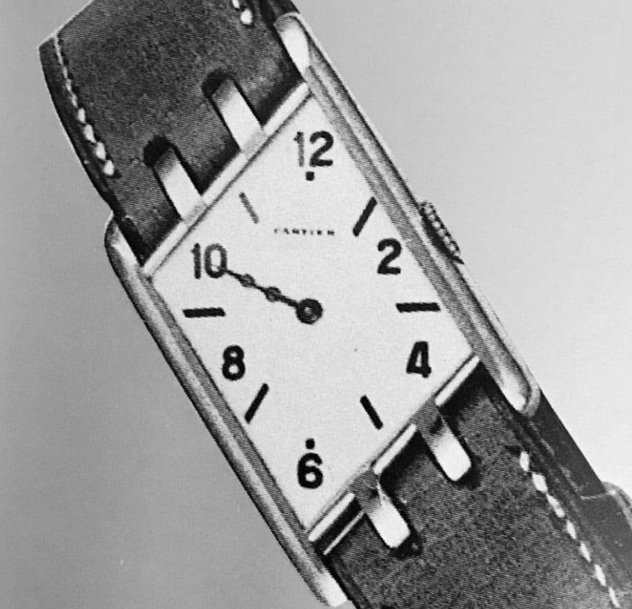
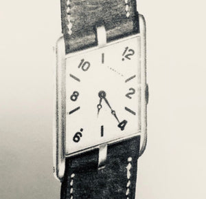
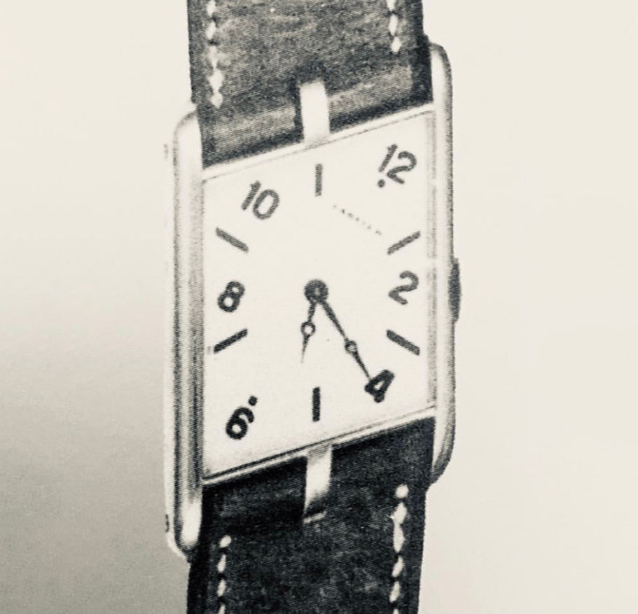
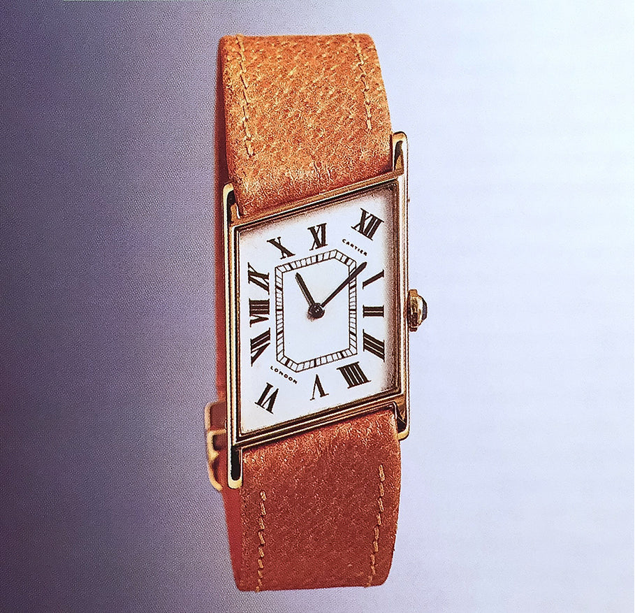
The Asymétrique, released in 1936, is often viewed as the last major reimagining of the brand’s Tank design.
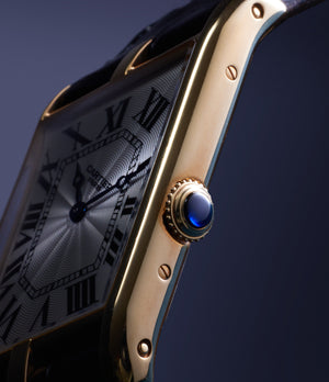
This oblique version of Louis’ Tank design from 1917 was achieved by rotating the dial around 30 degrees clockwise for ease of reading the time while steering a vehicle. The rectangular Tank case was also refashioned with the right-hand side angled upwards so 12 o’clock is directly under the top right lug. The crown, usually perfectly centred on the right-hand flank of the Tank, was also lowered. Notably, in the earliest iterations of the Asymétrique, the crown has a minimal profile, devoid of the cabochon Cartier is known for.
The original watch, born in an era before watches wore names, would go on to be known as the Tank Oblique, Tank Parallélogramme and Losange before the sobriquet Asymétrique stuck.


Made in sparing numbers in yellow and white gold, the 1936 Asymétrique features either off-white or black dials, notably with more readable Arabic numerals. Below 12 and above 6 are dots, helping orient the eye when looking at the asymmetric dial. The numerals are alternated with printed batons and in some examples they are replaced with triangular hour markers. The heat-blued hands can be Breguet or gladium-style. Some examples are also known to have gold hands. Courtesy of The Rake.
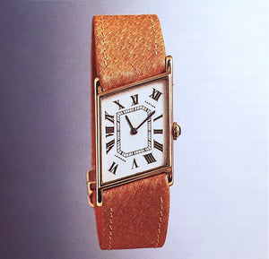
On the inside is an octagonal 8’’’calibre by European Watch and Clock Company, the maker jointly created by Edmund Jaeger (one half of Jaeger-LeCoultre that would come to be in 1937) and Cartier, to create movements for the latter’s timepieces. It is, in fact, the same calibre found in the Reverso of the day. “Later, Cartier introduced two different models, montre losange avec brides, with three and four lugs,” says Montanari. “This model [with three lugs] is very rare – one example in yellow gold is located in the Cartier heritage department. But the rarest is the Asymétrique with four lugs; I have only seen one in Cartier's archive photos.”
-

While Cartier went on to produce more examples of the Asymétrique with three lugs, the four lugged version, of which a miniscule number were made, still eludes even the most dedicated collectors. Courtesy of Auro Montanari.
-
-
A London Asymétrique from 1936, featuring a more classical dial reminiscent of the Tank, with Roman numerals and an asymmetric railroad-style minute track following the shape of the case. Courtesy of Auro Montanari.


Just like the original Asymétrique was hand-made in sparing numbers, so it has remained over the course of its story as one of the brand’s most enduring, if sporadic, lines. “The Parisian company produced the ‘montre losange’ models for around 15 years,” says Montanari. “Later, at the end of the 1960s, the London branch launched a few wristwatches with the same shape and a circular, flat Jaeger-LeCoultre movement. The dials had a more modern and stylised, graphic layout.”
The Reissues: Neo-Vintage and Modern Asymmetry
The Asymétrique was reissued twice, in 1996 and in 2006, preceding and then catching the tail end of the Collection Privée Cartier Paris (CPCP). We covered these two releases in our previous piece that looks in great detail at this exciting period for Cartier. After the CPCP range was finished, the Asymétrique would not return to the catalogue until 2020 with an even more limited release of 300, spread evenly between platinum, yellow and white gold.
-

This three-lug Asymétrique, circa 2006, is identical in proportions to the modern watch but is marked apartment by its CPCP hallmarks.
-

-


On the wrist, the larger footprint is noticeable, even though the parallelogram shape is suited to the shape of the wrist. If anything, the shape serves to mask the size. The third lug gives the strap an additional element of rigidity and form, while the crown, in an off-set position on the flank, is intuitively placed, similar to where you would hope to find it on a rectangular or round-cased watch.


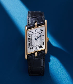
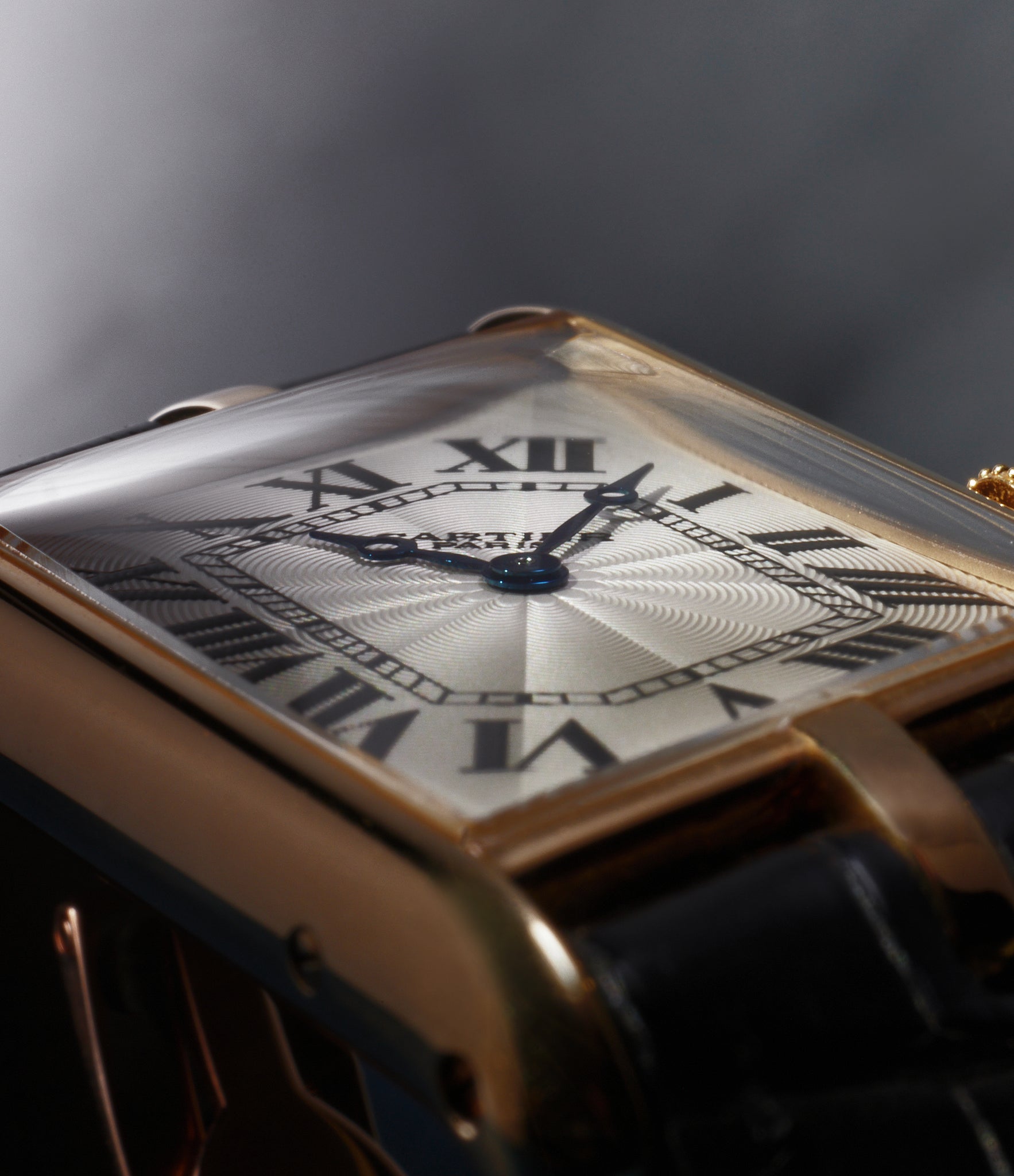
The modern Asymétrique, released in 2020, features elements from many previous iterations. It has elongated Arabic numerals with dots above six and below 12 o’clock, like the original watch, with just Cartier printed on the dial. “Swiss Made” is printed in small lettering in the bottom corner. The third, central lug is another reference to past watches. However, the overall package is very modern – the case is around 47x26mm. Made in platinum, yellow gold and white gold – with 100 pieces of each – it is another limited release. Courtesy of Cartier.
The American Story


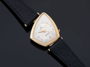
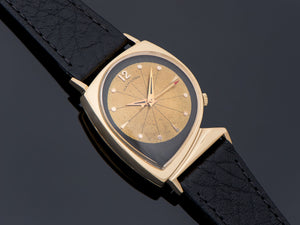
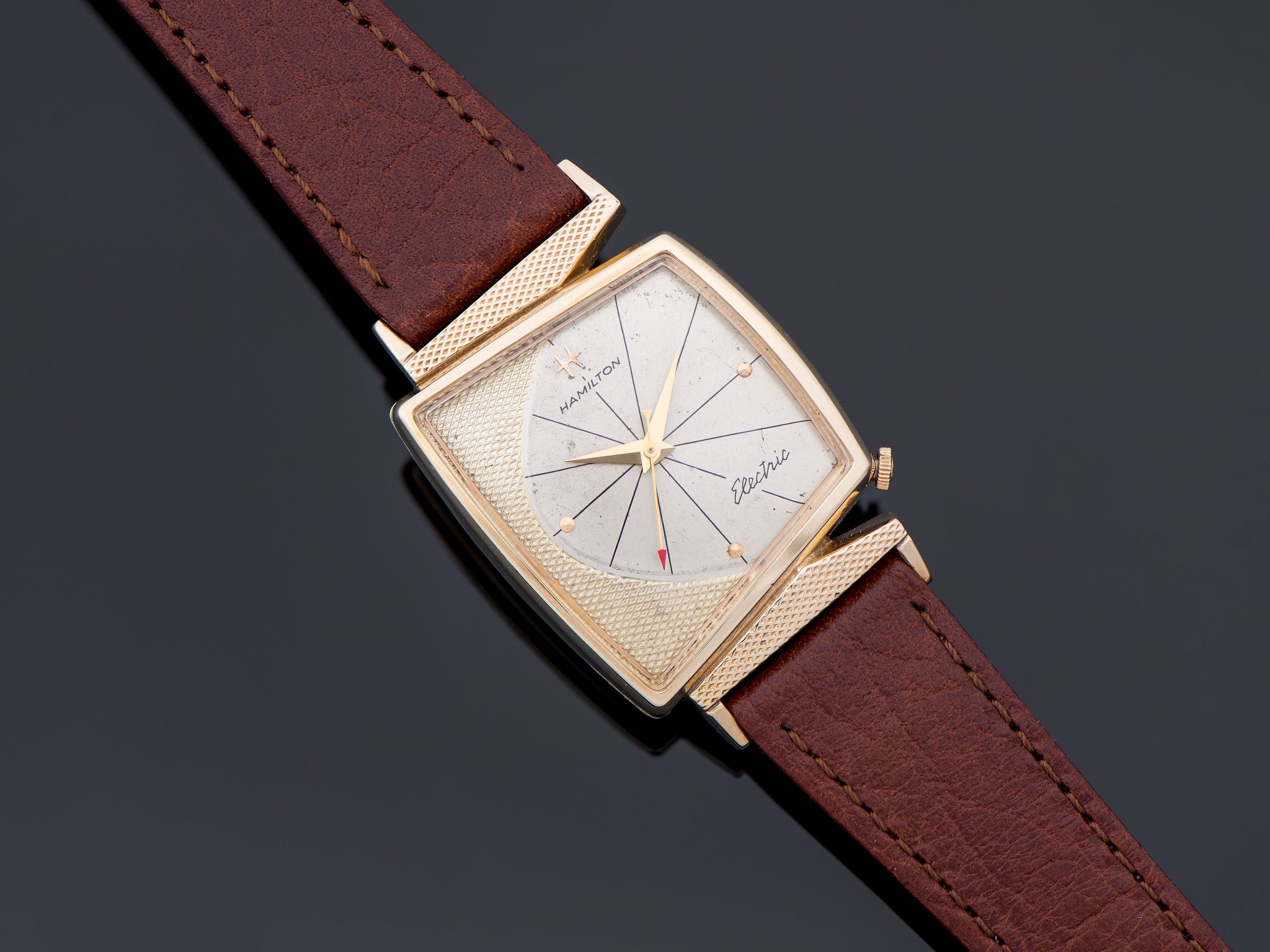
The story of asymmetric-cased watches in the United States is tied closely to the advent of the first electric movements. In the years after WWII, Hamilton, like all American watch brands at the time, faced stiff competition from inexpensive Swiss watch imports that were flooding the US market. “There was pressure to come up with something that would differentiate these brands from the Swiss,” says Jeffrey P. Hess, owner of Hess Fine Art, author and Hamilton enthusiast. Developing an electric calibre was one way to do this and, by 1957, the brand from Lancaster, Pennsylvania, had already spent the better part of the decade working on it.
It decided to showcase its new electric calibre 500 to the world in a watch that was extremely visually arresting. On 3 January 1957 it revealed the Ventura. It was like nothing Hamilton’s conservative clientele had seen before, says Jarett Harkness, owner of Unwind In Time, a platform specialising in vintage Hamilton watches. Even for a period known for its fascination with futuristic design, this was out of left field.
The main case was an exploded V-line design, a signature style championed by Richard Arbib in all that he designed, from boats to cars and watches. While today Arbib is viewed as one of the pre-eminent American mid-century designers, when he was hired by Hamilton he was still fresh from his experience in the US military during WWII. Hess and Arbib met for an interview in Arbib’s rent-controlled New York City apartment in 1986 and thereafter developed a close relationship until Arbib passed away in 1995.


The original Ventura, with the bi-colour bracelet it was sold with in the first few months of production. Alongside is a sketch of one of the original designs for the Ventura by Arbib. Courtesy of Unwind in Time and Jeffrey P. Hess.
Hess says, “Arbib maintained that his design for the Ventura was in fact inspired by bombs. He explained how he had worked in the military during WWII designing bombs and this winged, V-line bomb design formed the basis of almost everything he designed.” The Ventura’s triangular case also had another corner, by the crown. “Arbib imagined all his watch designs with integrated straps and bracelets, flowing organically from the watch head. This was a design Hamilton judged would be too expensive to produce,” adds Hess. The solution was to create hooded lugs, as if a sculptural extension of the case itself. The lugs, with their stepped design, were asymmetric too. Curving down from the case, they served the dual purpose of shaping the long case and ‘integrating’ the strap. The Ventura case was 31mm wide and 49mm lug-to-lug, with a thickness of around 12.5mm. Notably, for the first few months of production, the Ventura was sold on a bi-colour strap, one half covered in 24k gold appliqué, the other half in black leather.


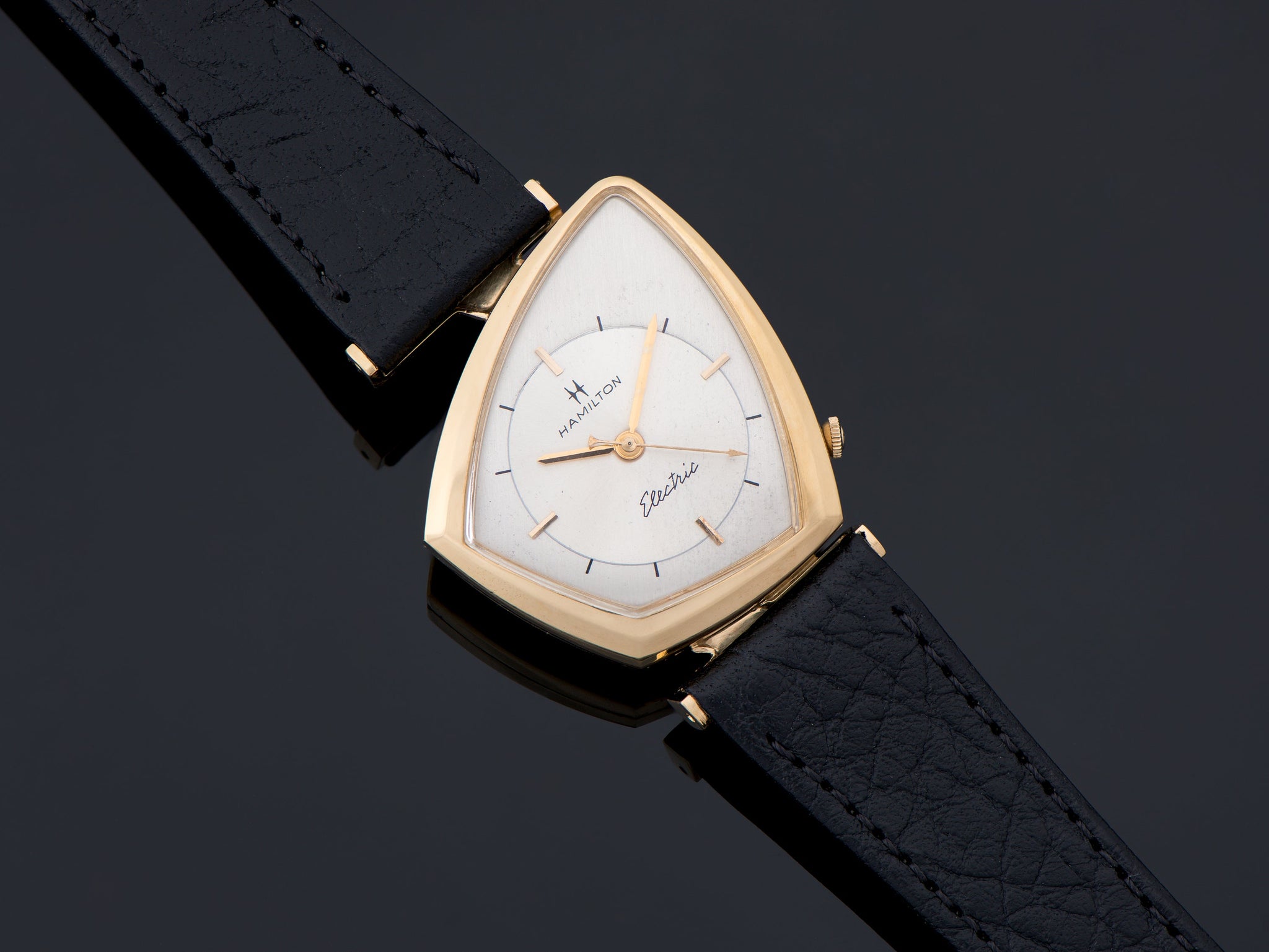
The hooded lugs were the most prominent of the differences that set the Ventura apart from Pacer – another one from Hamilton’s extensive asymmetric catalogue. The Pacer featured Hamilton electric calibres 500, 500A and 505 between the years 1957 and 1969, with 42,800 examples being produced. About 800 examples of the watch were sold as the Pacermatic, with a self-winding calibre. Courtesy of Unwind in Time.
René Rondeau, a Hamilton expert and author of books such as The Watch of the Future: The Story of the Hamilton Electric Watch, says, “The Ventura was originally released in a 14k yellow-gold case, with a 14k white-gold case made available in October the following year. Both options were on sale for $200, with the silver and black dials available with diamond indices that would set the new owner back an additional $100. In October 1958, Hamilton also created a 18k yellow-gold version to export to Europe, since 14K was not consistent with the continent’s purity standards. Another rose-gold version was created for the South American market.”
“The electric watch was developed to fill this need: the need for a watch as modern as today… a watch that fits into the world of automatic elevators, toasters, washing machines, radar control, missiles, automatic pilots, and many other servants of man which have built-in protection against human frailties.”
Harkness says there are a few other details to look out for in the reference produced between 1957 and 1963. “The standard dial never changed designs over the years as the Pacer did, so if it does not have the standard ‘Hamilton Electric’ in block lettering with ‘Pat. Pending’ below the 6 and the ‘resistor’ symbol from the 3 to 9 o’clock, one should question originality,” he says. The exception to this rule is the diamond dial variations which could have “Electric” in a cursive font and no “Pat. Pending” below 6, Harkness adds.


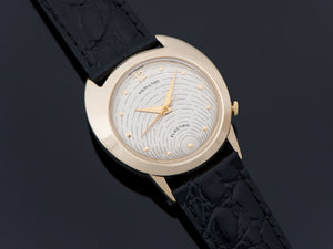
The dial furniture was inspired by electric circuitry with applied dot indices and printed line markers. Between 3 and 9 o’clock ran a graphic approximating an electric resistor. The hour and minute hands were leaf-style, of a shade corresponding to the case material. The seconds hand had an arrowhead. Courtesy of Unwind in Time.
The asymmetric design of the Ventura was doomed by the electric calibres inside. The three electric calibres the brand used – calibres 500, 500A and 505 – were beset by problems. “The task to create an electric calibre, called Project X, was shrouded in secrecy since its inception in 1946, as Hamilton feared competition from other American makers and Japanese brands,” says Hess. “Hamilton was rack-testing 1,015 of its electric calibres that were plagued with problems. Yet, almost simultaneously, it was also selling watches with these movements inside. The rush to bring the watch to market meant the calibres were underdeveloped.” While each iteration was more reliable than the one before it, they were never fit for purpose.
Sales suffered and by 1963, although 11,750 examples of the Ventura had sold, production was suspended. The promise shown by quartz technology and the release of Bulova’s Accutron electric calibre proved to be the final blows and Hamilton closed down production of its electric calibres by 1969.
-
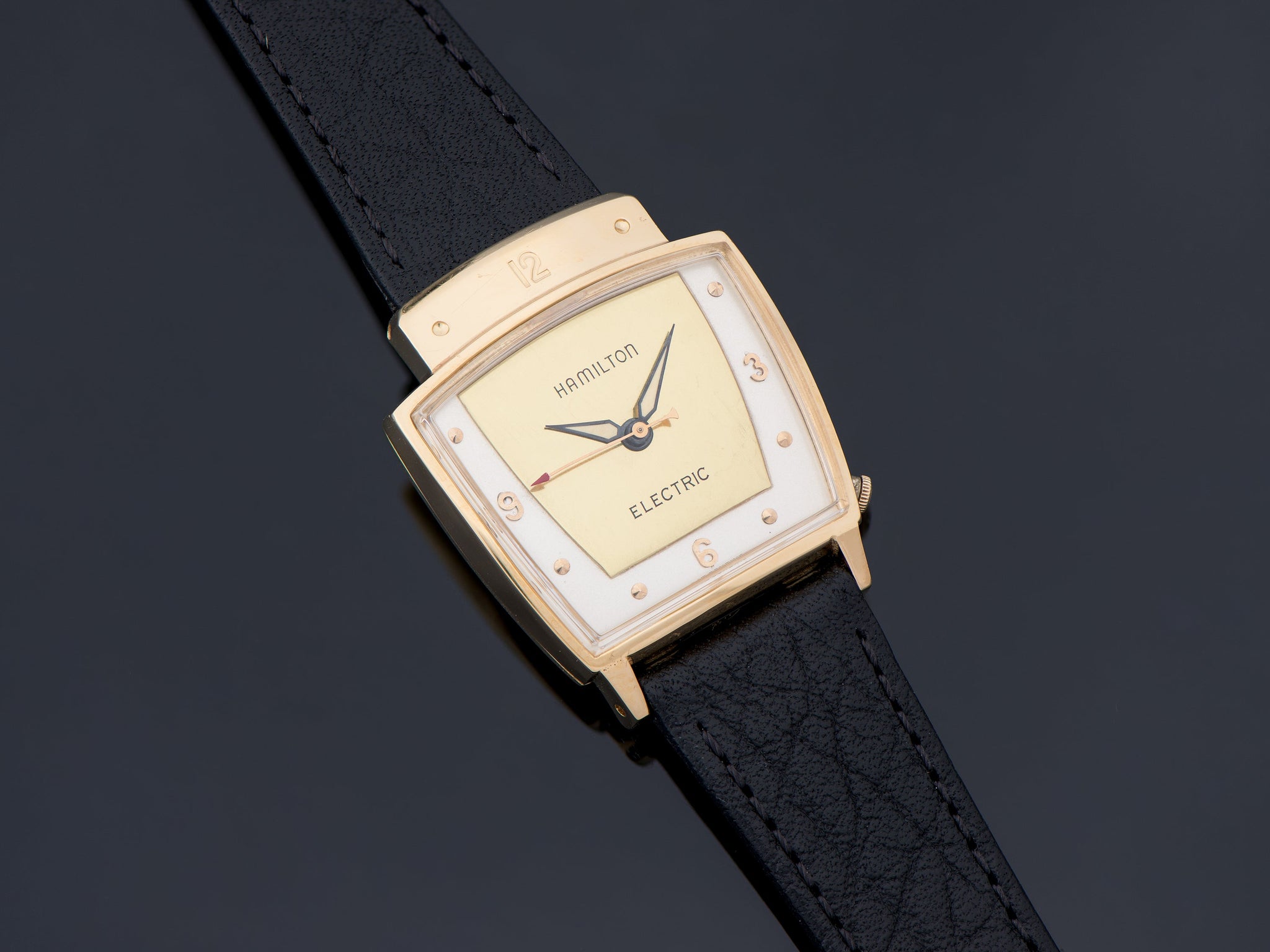
While Hamilton had produced pieces such as Spur in 1929, the late 1950s and 1960s were marked by a whole catalogue of asymmetric designs such as the Altair, Spectra, Everest, Meteor, and Vega seen here. These designs are attributed to Arbib. Courtesy of Unwind in Time.
-

-

-

-


After it stopped producing the Ventura, Hamilton made around 500 as the Ventura II, for the explicit purpose of corporate gifting. These feature Ventura dials in 14k yellow-gold Pacer cases. The Ventura was reissued in 1988 in a variety of plated metals and dial combinations, until the turn of the millennium when Hamilton started producing the watch with a stainless-steel case, according to Rondeau. It can still be found in the company catalogue today in a number of guises.


Arbib’s sketches had a profound impact on mid-century design, from automobiles to boats and dirigibles. Courtesy of the Richard Arbib Company.
Even after Arbib’s contract with Hamilton ended, and after the experiment with electric calibres, the brand continued producing watches inspired by the designer’s style. Pieces such as the Flight I, T-403, Accumatic A-504, Valiant, and Blade are marked by their asymmetry. And Arbib’s futuristic influence was felt beyond Hamilton: when Bulova introduced the Accutron, with its tuning-fork regulator, it too leaned heavily on a similar asymmetric aesthetic.
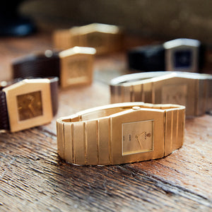
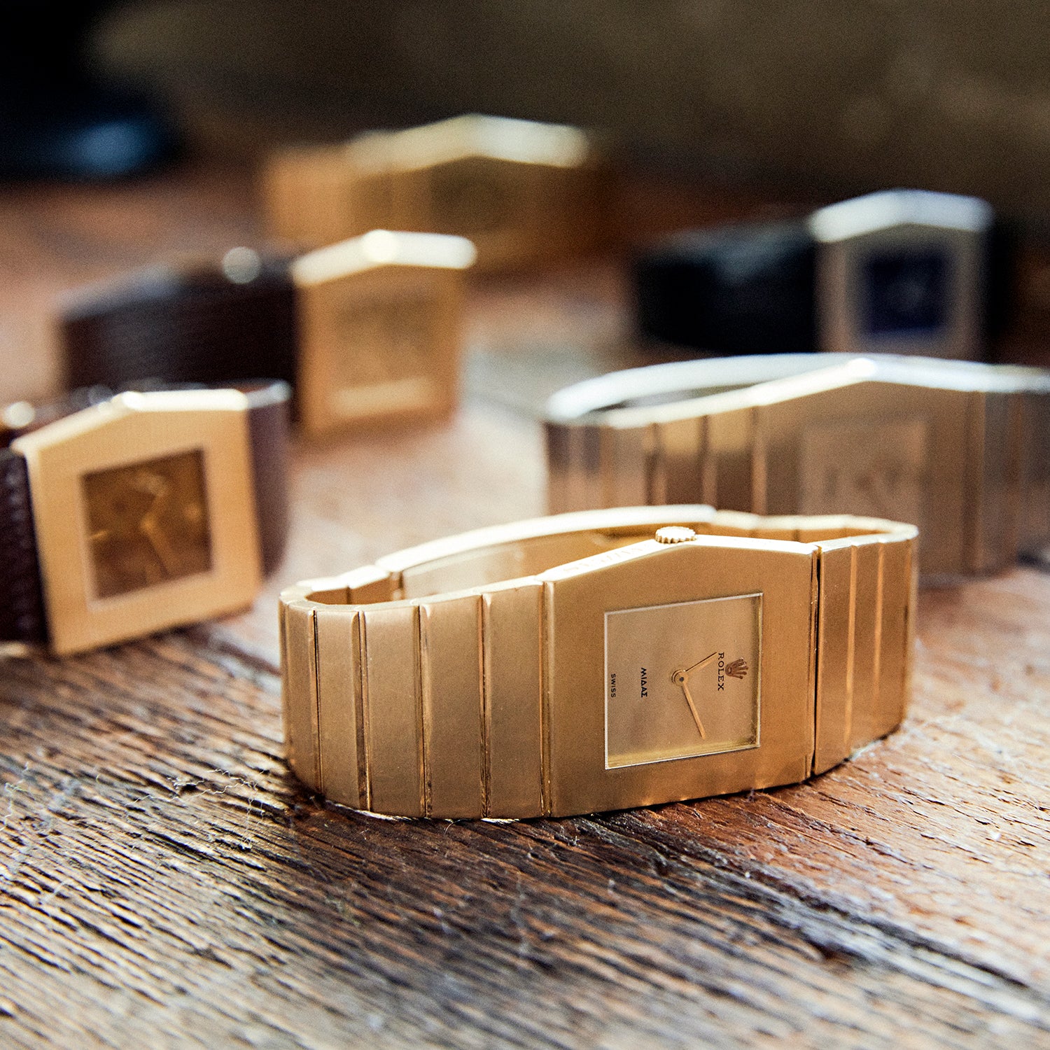
Asymmetry From an Unusual Place


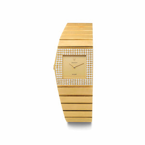
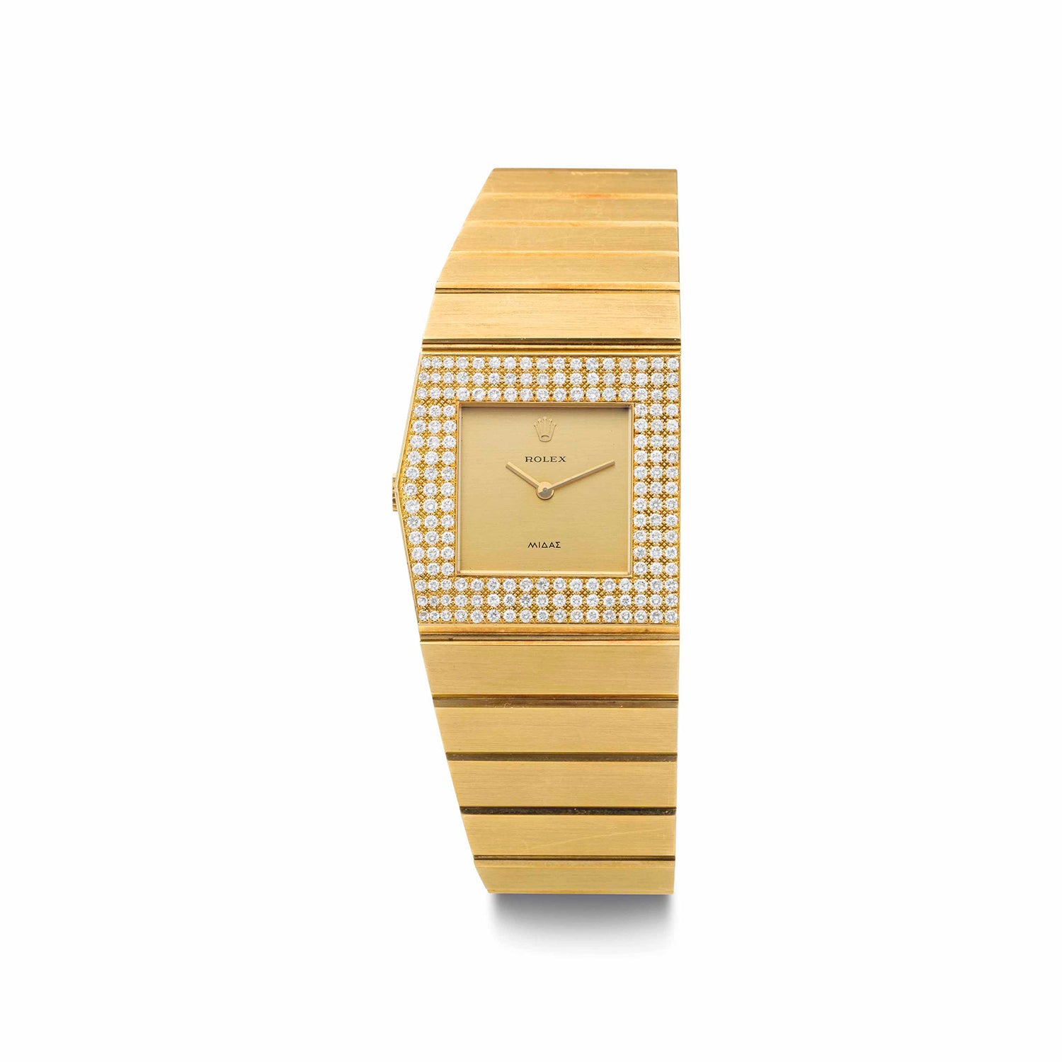
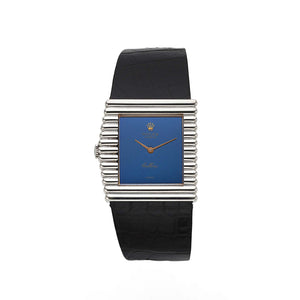
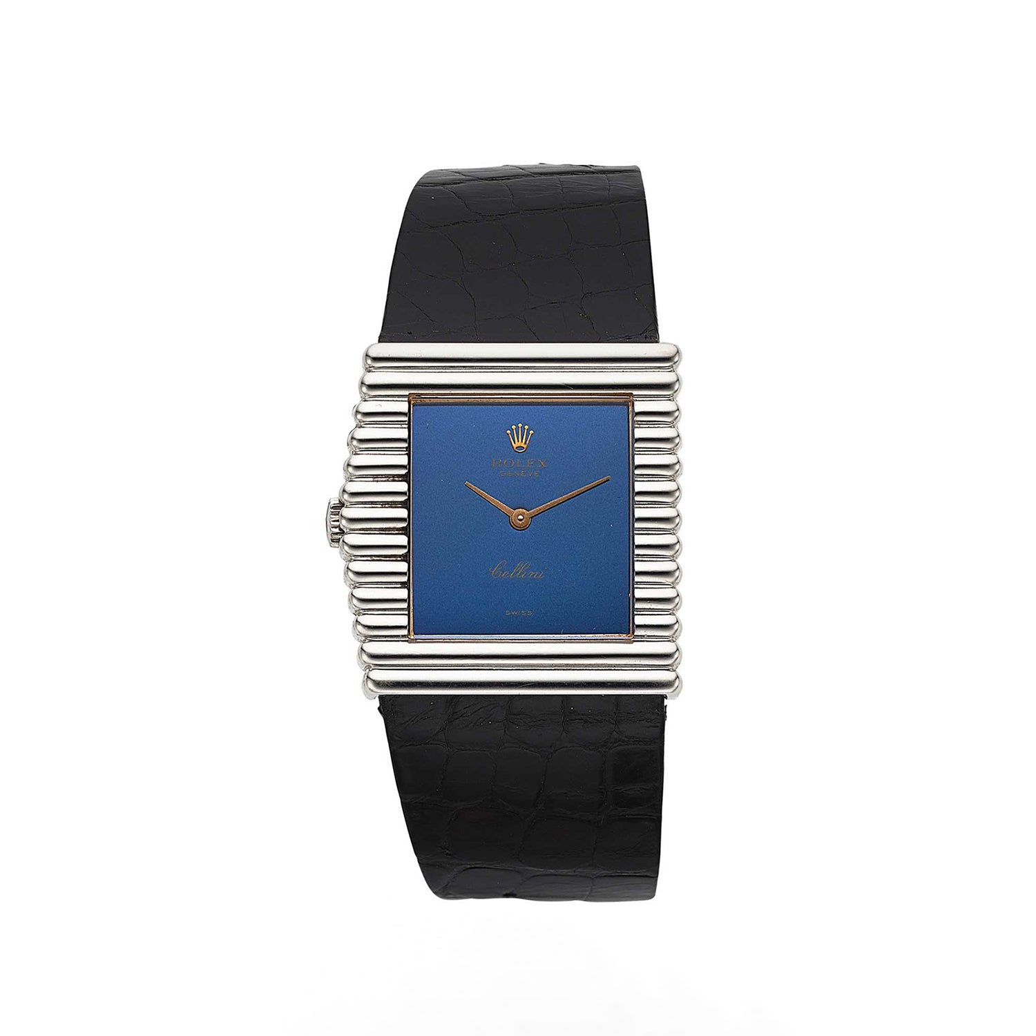
First making it to Rolex catalogues in 1962, the King Midas ref. 9630 looked like nothing that the brand had produced before it and, with the benefit of hindsight, nothing like it would go on to produce afterwards. However, Manuel Knospe, owner of Plus Ultra, a seller of vintage watches based in Pfäffikon, Switzerland, with a particular interest in the King Midas, thinks it would be wrong to think of the line as the result of some temporary loss of direction.
The limited series was thoroughly planned, says Knopse. “[It was] made using the best technology and materials Rolex had access to, with seemingly no expense spared. It was so solid, so well-made – designed to last a lifetime. It makes me think old man [Hans] Wilsdorf was thinking about the legacy he was leaving behind and wanted to create a watch to match that,” he added. Designed by Gerald Genta, the ref. 9630 might have been one of the last major projects that Wilsdorf signed off on for the brand before his death in 1960, Knospe thinks.
Eric Peng Cheng, owner of streetwear labels Undefeated and Bait and a collector of asymmetric King Midas watches, says the King Midas represented a marker in time not just for the era it was born in, but also for the brand that produced it. “It is not just a unique watch, but an unexpected design from Rolex, one of the most strict and inflexible brands in the modern era. I don’t think the King Midas design would be released by Rolex now,” he says.


The ref. 9630, while unusual for the Rolex of today, was a watch from an era when the brand did not have such a regimented design philosophy. Courtesy of Auro Montanari.
The official communication around the new watch in 1962 was also unique. The ref. 9630 was advertised as the heaviest, most expensive and rarest Rolex that only a few would be able to see in person, let alone have the opportunity to buy. While the brand planned to make 1,000 pieces of the reference, in the end it made no more than 790. “It could not have been made to turn a profit,” says Knospe. “It was significantly more expensive to make than the most expensive Oyster case watch of the time and, based on the number Rolex planned on making, it would be near impossible for the ref. 9630 to be profitable.”
Crafted entirely by jewellers’ hands, it meant that almost no two ref. 9630s are exactly the same, and in terms of weight they were each forged from around 180g of solid gold. This meant the watches were significantly heavier than anything else in Rolex’s catalogue. Just 144 ref. 9630s were made in white gold, while the remaining were all produced in yellow gold.


The crown-side flank of the King Midas, with its characteristic etching. Owing to the hand-made nature of the watch, no two cases, or indeed etchings, were exactly the same.
As the name suggests, the 27mm-long case, pentagonal in shape, references Greek mythology. Describing the ref. 9630’s asymmetrical case, Ben Dunn of Watch Brothers London says, “When placed on its side, it is designed to be reminiscent of the Parthenon in Greece, with the bracelet grooves playing the role of the temple columns. My favourite detail – and one that can easily be overlooked – is the saw-tooth crown. Sitting proudly atop the pointed side of the case, it is designed to represent the sun as if rising over the temple.”
The dial, visible through the square sapphire crystal, is actually round, its true shape hidden by the case. Its colour corresponds to the case material and features Midas printed on the lower half of the dial, in lettering meant to approximate the Greek alphabet. The top half of the dial features an applied coronet with Rolex printed below it. At 6 o’clock the dial wears the “Swiss” mark, printed on. Aside from the simple, straight black hands, there is no other dial furniture to speak of. On the crown-side, the words “King” and “Midas” are etched into the flank on either side of the crown. However, Knospe says this was not a feature of the first 250 or so pieces of the ref. 9630. However, all subsequent ref. 9630s appear to have had this etching. Equally, on no two watches is the style of etching exactly the same, owing again to the hand-made nature of the reference.


The double concealed deployant clasp of the ref. 9630, and the later ref. 3580, were markedly different from the single fold clasp of the ref. 4315. As was the bracelet – the ref. 9630 and the 3580 featured the ‘massive’ bracelet that was the same thickness as the case. The ref. 4315, owing to the economics of the time, featured a slimmed down variation.
The 3.8mm-thick solid-gold bracelet, roughly the same width as the watch case, is totally integrated into the case and follows its asymmetric form. While totally flat on the right side, on the left it tapers all the way down to the concealed, double deployant clasp. “The bracelet essentially could not be removed and sizing it required intervention from a skilled jeweller,” says Dunn. “So, it is essential to consider this when looking into buying a ref. 9630.”
The ref. 9630’s rarity was a veritable feature of the watch – its number (out of the 790 or so made) was etched in elegant calligraphy on the inside of the bracelet. Its limited numbers meant it was relatively easy to keep a track of famous owners. Rock ’n’ roll star Elvis Presley owned number 313 while Hollywood actor John Wayne is believed to have worn number 557. The inside of the bracelet is also where the wearer can find details such as the reference and serial numbers.
The caseback is circular, concealing the Rolex calibre 650, based on the Frederic Piguet calibre 21 (also known as the Blancpain calibre 21). Thin and manually wound, it only shows hours and minutes and perfectly suits the ref. 9630’s slim profile. Around the caseback are the hallmarks of the precious metal the watch is forged from.
The presentation box is shaped like a black leather urn, with scenes from Greek mythology depicted in red. On the lid is the visual representation of the legend of Silenus, a satyr (a woodland god) and companion of Dionysus (the god of revelry and wine), being presented before King Midas. The king decided to give Silenus shelter, despite his drunken countenance. As a token of his gratitude, Dionysus is said to have granted Midas one wish, as the often-told cautionary fable goes.
While this was the basic configuration the ref. 9630 was available in, Knospe points out that the Rolex of the 1960s (the ref. 9630 was produced between 1962 and 1972) was very different from the company it is today. There are variations, such as about 100 examples of bi-metal bracelets featuring alternating yellow- and white-gold links, that could have been the result of a client’s special request, he says.


Cheng’s bi-metal ref. 3580 was likely specially commissioned by the original owner.
In addition, while it was initially designed to be worn on the right wrist, later in the production run Rolex made concessions for those who did not want to do so. “Initially, the dial featured a hole on the top left corner through which a corresponding pin on the calibre passed to attach the two together,” says Knospe. “Later on, the dial had holes on the bottom right corner as well. As a result, the dial’s orientation could be changed by 180° to accommodate those who wanted to wear their ref. 9630 on the left wrist.”
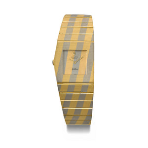
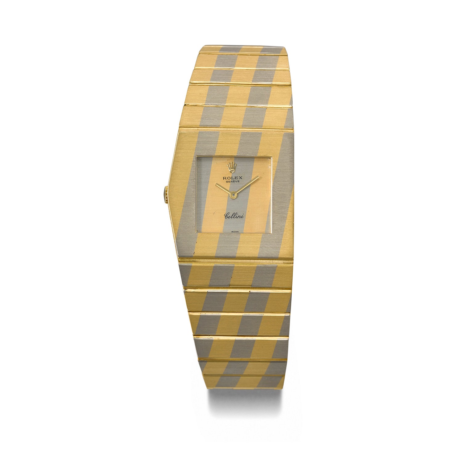
The reference 3580
Released in 1972 and produced until 1976, the ref. 3580 is essentially the same watch as the ref. 9630. It is identical in appearance as well as in weight, and even featured the same heavy bracelet with the double deployant clasp.
However, this is the reference that would see the King Midas transition from a standalone line to being absorbed into Rolex’s Cellini umbrella of dressier watches. The name Midas started being replaced by Cellini branding on the dial. However, the first couple of hundred ref. 3580s still came with Midas on the dial. “This can simply be attributed to the fact that the ref. 9630, of which a 1,000 were supposed to be produced, had a truncated run,” says Knospe. “Rolex probably had a couple of hundred Midas dials left over and decided to use them in the new ref. 3580. When they were done with those, the watches only came with Cellini on the dial.”


A vintage ad for a Rolex King and Queen Midas. Note the Midas branding still on the dial even as the watch was being integrated into the Cellini line. Courtesy of Retro Print Ad.
Cheng adds that he had noticed that Midas appeared on the dial of more white-gold and bi-metal versions of the ref. 3580 than on yellow-gold examples. “The decision by Rolex to use up the remaining Midas dials from the original 9630 production run is another example of something the brand would never do now,” he says.
Over the years, several later-numbered ref. 3580s, and indeed even later references, have come up with Midas dials. “The most plausible explanation for this is that over the years, a large proportion of King Midas watches were smelted down for gold,” says Knospe. “That left a surplus of calibres and dials, some of which were fitted to watches produced after the Midas name disappeared from the dial.”
Another relatively small update was the calibre 651 – a minor iteration of the calibre 650. Over the course of the ref. 3580’s short four-year production run, Rolex created fewer than 500 pieces; most of them were in yellow gold, with a much smaller number made from white gold.
While the 1970s had begun with gold prices at $35 per ounce, by the end of the decade prices had risen by more than 500%, standing at $850 per ounce. This started reflecting in the ref. 4315, which was first revealed in 1977. Produced for just two years, it is marked apart by its thinner bracelet which did away with the double deployant for a single fold clasp. Another key difference is that the bracelet, screwed on to the case, can be taken off. While the proportions of the case were unchanged, it wears very differently due to the thinness of the bracelet and a reduced 125g weight. On the inside, the calibre 651 continues.
Most references from the 1980s transitioned from the calibre 651 to the calibre 1600, and then to the calibre 1601, both produced in-house by Rolex. They are similar in specification to the 651.
Queen and Princess Midas
The first Queen Midas was the ref. 9904, released along with the ref. 9630 in the early 1960s. It has a smaller, 23mm case but is made with the same amount of gold as the King Midas. As a result, the watch and the bracelet are noticeably thicker in profile. The Princess Midas (ref. 9903) from the same era is smaller still at 19mm and weighed in at around 150g. While around 50 pieces of the Queen Midas were made, Knospe thinks only about 30 examples of the Princess Midas ever existed.
The Queen Midas ref. 9904 starts with the number 500 while the Princess Midas ref. 9903 starts with the number 700. “The entire Midas range followed the same numbering series. So, while the King Midas started from number 1, there are certain numbers in the middle of the range that were assigned to the Queen or Princess Midas watches,” says Knospe. “The deduction of the number of Queen and Princess Midas watches produced is based entirely on the gaps in the serial numbers of the Midas range since the information is not well publicised.”
-
With the integration into the Cellini line, the King Midas range saw a significant widening in its offering through the late 1970s and all the way to the early 1990s. Subsequent asymmetric references, based on the bones of the ref. 4315, include the diamond set cases of the ref. 4609, seen here, as well as the ref. 4344, which feature a ribbed case and a bracelet with a similar texture. Courtesy of Christie’s.
-
The ref. 4017, ref. 4031 (with a pavé diamond case and diamond hour markers), the ref. 4126 (with a hobnail case) and the ref. 4015 seen here (with a more pronounced ribbed case) were some of the many variations on offer on leather straps. Courtesy of Revolution.
-
References like the 4151 and the 4153, seen here, feature enamel bezels with Roman numerals. Courtesy of De Mesy Fine Watches and Jewelry.
-
Some of the more complex cases include ref. 4912, which feature a bi-metal, striped case made from yellow and white gold. The ref. 5038 added yet another metal to the mix – the case is constructed from strips of white, yellow and rose gold. Courtesy of Christie’s.
-
King Midas references sport a variety of dials – there are tiger eye, lapis lazuli and stone set varieties – with dial furniture that ranges from slim baton indices to gold dot markers and even ones featuring Roman numerals.


The King Midas was eventually phased out in the 1990s, with one of the last in the series wearing the number 6XXX. It once again recently found a following among artists and musicians including Rihanna, A$AP Rocky and The Weeknd as well as collectors such Cheng, who thinks its versatility is in no small part thanks to how it wears on the wrist. While Rihanna wears hers on a bracelet, The Weeknd prefers his King Midas on a strap. Cheng says, “I wear [the metal bracelet King Midas] like [a] precious-metal bracelet and treat the watch as a secondary function. I wear [the leather strap version] as a dress watch, similar to a Cartier Tank, on days when I feel like a mature, sophisticated gentleman.”
Crashing Convention


No conversation about asymmetric Cartier watches is complete without mentioning the Crash. This watch, after all, is the quintessential watch of the 1960s. Montanari says, “At the time, Cartier London did not make its own wristwatches but relied on importing them from Paris. In the early 1960s, Jean-Jacques Cartier employed goldsmiths, jewellers and other craftspeople, giving the London workshop the ability to create independently from the Paris branch. The watches that emerged from Cartier London in the 1960s and 1970s are considered some of the most important designs in the brand’s history.”
The desire to produce watches independently was also driven by demand from local clientele, says Francesca Cartier Brickell in her book. Prominent customers, including actor Stewart Granger, were hungry for a watch “unlike any other”. So, designer Rupert Emmerson was tasked with reimagining the Maxi Oval case by “pinching the ends at a point and putting a kink in the middle”, by request of Jean-Jacques Cartier, according to Brickell’s book.
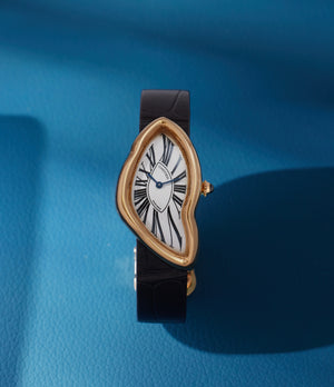
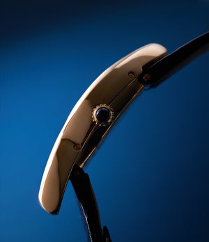
While some sort of geometrical symmetry can be found within the design of the Asymétrique, there are none in the design of the Crash. After creating a template for the design, sheets of gold were employed to create the case in the Cartier-run Wright & Davies workshop. Afterwards, jewellers filed and polished the case by hand, taking much longer than the 35 hours it normally took them to create a watch case. This was so the Crash could fit the oval-shaped Jaeger-LeCoultre calibre 841 that would power it. Looking at the watch in profile reveals the 43x26mm case’s almost dome-like curvature, a factor that is crucial to its wearability.


The original, from 1967. Courtesy of Loupe This.
The surrealist dial had to be hand-painted and, owing to the irregular position of the Roman numerals, was at risk of not being a usable design. After going back to the drawing board several times, the decision was made to ensure that the XII and VI and III and IX were along the same planes, even if the whole dial appeared as it had been rotated a few degrees clockwise. This would ensure that despite its unique shape, the business of time-reading is familiar.
Initially, fewer than a dozen examples were made, all from yellow gold, with “Cartier” and “London” on the dial. When it retailed in 1967, it was priced at $1,000 according to Brickell – a number that didn’t quite make fiscal sense, given how labour-intensive the process of creation had been. However, today the small number of Crash watches that Cartier London produced are some of the most collectible due in part to its rarity, the originality of the design and its distinctive “soft watch” case. In 2022, an example sold at auction for $1.5m (around £1.2m) – a record price for a Cartier.
There were a couple of small recurrences of the Crash between its initial run in London in the late 1960s and early 1970s. A few were created by Cartier London in the 1980s and another handful of platinum pieces by Cartier Paris in the early 1990s.
-

While obviously much thinner than a round-cased watch, a modern 2019 Crash is exceedingly wearable thanks to its length (at just over 45mm). Its asymmetric case, while making it hard to compare it to any other watch, is helped by the curvature of the parts of the case that hang over the strap.
-

-


The first major reissue came in the early 1990s. Montanari says, “In 1991 Cartier Paris released a limited edition of 400 watches in 38.5x22.5mm with yellow-gold cases with the word “Paris” on the dial instead of London. A few examples were also made in white gold, in platinum and with a diamond-set case.” The smaller case, aimed at easier wearability, is much less complex in its construction, thanks to a flat caseback.
Prompted by the demand for the Paris Crash, Cartier London made a faithful reissue of the 1967 watch around the same time. The small batch was made in both white gold and platinum and were the last Crash watches to ever feature the London mark on the dial. In 2013, in celebration of its 267th year, Cartier produced 267 Cartier Crash watches in white and pink gold, with a separate numbered edition of 67 watches with the bezel and bracelet featuring diamonds. The cases measure 38.5x25.5mm.
In recent years, Cartier has been more prolific with its Crash releases – relatively speaking, of course. In 2015, a larger 45.3x28.2mm Crash in platinum was released. Limited to 67 pieces, it features a skeletonised dial in which the Roman numerals are cut out. The display caseback showcases the skeletonised manual-wind calibre that followed the form of the case.


In 2016, the same skeletonised Crash was made in rose gold, again limited to 67 pieces. These watches are set apart by the much gentler curvature of the case, which means they wear very differently than the 1967 original. In 2018, Cartier introduced a 50-piece edition called the Crash Radieuse. It features a unique stepped case measuring 38.5x25.5mm, with a dial that is said to be an artistic interpretation of the ripples in a pond.
Cartier also issued another 15-piece edition of a faithful reissue of the London Crash in 2018. The only difference was that the dial wore “Swiss Made” instead of the London mark. Inside beat the calibre 8971 MC, based on the Jaeger-LeCoultre calibre 846. It was only available for sale at Cartier’s New Bond Street boutique.
Most recently the brand has reimagined the line as the Crash Tigrée. As has been the practice, this too is limited – this time to 50 pieces. Montanari says, “To create the present wristwatch, the Cartier’s artisans used a compendium of crafts, gold engraving, enamelling and diamond setting, seeking inspiration from the wildlife of Africa. With the artistic hues of turquoise, green and midnight blue, the Crash Tigrée is truly a piece of art.”
Modern Asymmetry
While asymmetric watches continued to be produced in the 1970s, 1980s and even 1990s, by then a consolidation of the watch industry was underway. Forces including the Quartz Crisis and mergers and acquisitions of smaller case- and dial-making operations by larger brands and conglomerates led to a more fiscally minded approach to watchmaking.
Mintiens says, “A watch is a technical and functional product that needs to meet certain financial criteria. Not imposing those considerations would mean you create art. Designing a product is a craft. Watchmaking is another. Being good at both is rather rare but when well done, it leads to iconic watches.”
Vivas feels the paucity of asymmetric designs in the modern era are partly to do with increasingly demanding standards of watchmaking. “The designs of the day [1950-1970s] were not constrained by modern standards of water, dust and shock resistance or precision,” he says. “Today when producing a watch we have to make sure it goes through a great number of laboratory tests and homologation processes that makes the production of a single watch or experimentation a lot harder. While we don’t rely on the watch to tell us the time any more, the wristwatch has never been as reliable as the ones we produce now. The process that has made that possible is often a long one.”


The UR-120 and the Richard Mille RM70-01 both represent thoroughly modern visions of asymmetry. Courtesy of Urwerk and Richard Mille.
Another factor of modern production is the use of machinery and automation to construct many parts of the watch, including the case. “The cost of making the watch is important,” says Mintiens. “Look at a Rolex case. It is extremely efficient to make. In five milling operations the case is made. The tooling used to make watch cases is designed to make a certain shape in the most efficient way. Changing the design of the case leads to higher costs.” The industrial risk, and associated cost, of making a design that may not have widespread appeal is too much for most brands to stomach. “They are not really pushed to change. Instead, they make re-editions, which involves no risk,” adds Mintiens.
However, both Mintiens and Vivas agree that the rise of the independent brands offers hope. “Look at the Horological Machines MB&F makes,” says Vivas. “They are very experimental in their forms and the way they tell the time. Often you wouldn’t even know you are looking at a watch.” Brands such as De Bethune, with its Dream Watch 5 and Dream Watch 5 Tourbillon “Season 1”, feature designs that hark back to Arbib’s generation. Mintiens also points to watches such as the Urwerk UR-120 and R-T8, designed so the wearer can read the time even with most of the watch case covered by a shirt cuff, as innovative modern examples of asymmetric watches.
Asymmetric designs have obvious limitations. “You eliminate a third of the population because they are left-handed and another half who don’t find peace in asymmetry,” says Mintiens. “Asymmetry is not as commercial as symmetry.” While this may have been why these watches were always made in small numbers, more purpose-driven asymmetric designs may guide independent watchmaking in the years to come.
Given the wide scope of the subject matter, we consulted several experts. We would like to thank Auro Montanari, Roni Madhvani, Francesca Cartier Brickell, Benoit Mintiens, Sébastian Vivas, Raphaël Ballestra, Eric Peng Cheng, Manuel Knospe, Ben Dunn, Jarett Harkness, René Rondeau and Jeffrey P. Hess for being generous with their knowledge and time and helping make this article possible.
Illustrations by Ian Macarthur.