


The balance of symmetry and asymmetry in dial design
Ask a 10-year-old child to draw a watch dial, and you'll likely get something very familiar. Twelve markers around the edge, two hands in the middle, perhaps a date at three, or a logo. The point of this exercise isn't to argue that you've discovered the next Genta, rather that it's remarkable how homogenous watch dial design is. From Rolex to Roger Dubuis, dials are almost always balanced, symmetrical affairs. There's a good reason for this, and why, when a watch fails to conform to this conventional design approach and opts for asymmetry, the results can be exceptional.

There are a lot of considerations that go into design, symmetry is just one, courtesy of Bulgari.
The science of symmetry
While symmetry is often associated with the soft, somewhat intangible pursuits in design, art and beauty in general, it's a concept rooted in hard mathematics and physics. In these pursuits, it has specific functions and meanings. A symmetrical object is typically an invariant one when subjected to rotation, reflection and other transformations. Without digging too deeply into the research, the fact is that people are attracted to the symmetrical. From the petals of a flower to the face of a supermodel, it has a powerful pull. A pull rooted in the fact that it is familiar.

In all design, symmetry seems to permeate through, courtesy of Christie’s.
On the opposite side of the coin, the asymmetrical can have an appeal all of its own. Take, for example, Fukinsei – one of the principles of the Japanese aesthetic of Wabi-Sabi, that describes the appeal of the irregular. Or the practice of including deliberate breaks in Islamic geometric art. In both these examples, the asymmetric or the irregular design elements still harmonise with the overall design. The same is true of watch dials.
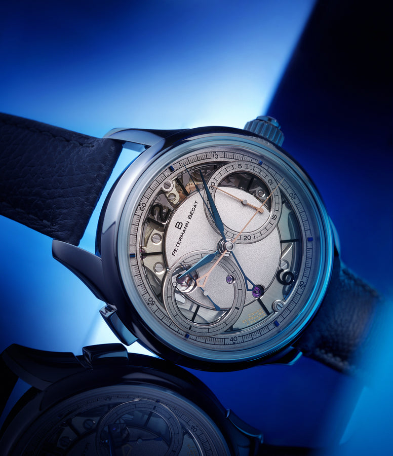
The fundamentals of a watch dial
It's remarkable, given the centuries of watch production and countless designs, just how similar watch dials are. The fundamentals rarely changes. A dial is a shape, usually a circle, bisected neatly into 30-degree increments, with hands in the middle. These parameters are defined by function.
No matter how much or how little decoration, complication or embellishment you cram onto a dial, it's there to tell the time. Functionality is core to good dial design. This is why watch dials, by and large, tend to be balanced. Even when certain elements, such as calendar apertures or sub-dials don't strictly require symmetry, our culturally ingrained love of balance kicks in, leading to the convention of an ordered, symmetrical dial design. It speaks volumes when a watch that displays time unconventionally – a jump hour or retrograde display for example – still errs on the side of symmetry when it is technically surplus to requirement.
Sometimes though, a design comes along that offers harmony and balance in an asymmetrical form. It's uncommon but visually arresting.
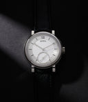
The Case of the Lange 1
Without a doubt, the most famous and celebrated example of asymmetrical dial design comes out of Germany – A. Lange & Söhne's iconic and decidedly asymmetrical Lange 1. It's hard to overstate the impact this watch has had on the trajectory of high-end watch design since its release in 1994, so it's worth exploring the context the Lange 1 was created in. The story of the Glashütte-based brand stretches back to the 1800s, but for the purposes of this article, it makes sense to look at the relaunch of the company on October 24th, 1994.


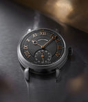
A standout approach to asymmetry from A. Lange & Söhne.
Of the four models released for this inaugural collection, the Lange 1 was the most unconventional. The gold watch displayed hours, minutes, seconds, a big date and a power reserve. A fairly typical — bar the big date — line-up of functions. However, the Lange 1 displayed them in a way that, in the landscape of mid-90s watchmaking, was shocking and even outré.
Respected Lange expert, Alp from Langepedia, attributes the unique dial of the Lange 1 to the brand's conscious decision to set itself apart: "For Blümlein, Meis and Klaus at the time, the Lange 1 dial was a canvas to reflect the fact that this is the modern A. Lange & Söhne, so it had to be different from the ones of the past. On the other hand, it was also a canvas to reflect that they care about tradition, hence the Roman Numerals and big date."
If the goal of the Lange 1 was to make it distinctive, Alp thinks they succeeded. "I struggle to find a more contrasting, yet astonishingly balanced piece in the whole catalogue. First and foremost, it is different. [Lange has] many drawings with differing size of indications, yet the one built according to the rule of thirds has won. In my opinion, its design is so strict, a change to even an index would ruin it. The dial of the Lange 1 is surely a reflection of the brand's extreme engineering on the movement side."

The balance that can be accomplished through asymmetry.
In addition to being good design in its own right, the Lange 1 is, Alp says, incredibly smart marketing. "Positioning theory explains it the best. This suggests that people have learned to rank products and brands in their mind. Think of it as a series of ladders. On each step is a brand name. And each ladder represents a product category. It is almost impossible for a latecomer to fight for a place if there's no differentiation. The Lange 1 is a new, unique ladder which happens to be a beautiful one. It has its identity, that cannot be imitated or altered, therefore, will always stand out as an A. Lange & Söhne."
If creating an iconic watch was as simple as disrupting the rules of dial design, everyone would do it. But that's not the case, and while the Lange 1's design team threw convention out the window, they certainly didn't throw out the rules – in particular, the Golden Rule, also known as the Golden Ratio. This formula, expressed by mathematicians from Euclid on, is used by designers to ensure harmony and balance. For the Lange 1, it means that the dial, while asymmetrical, is far from unbalanced. Following these principles allowed A. Lange & Söhne to separately place a large amount of dial infrastructure and text onto the dial without it appearing cluttered or busy.
“For Blümlein, Meis and Klaus at the time, the Lange 1 dial was a canvas to reflect the fact that this is the modern A. Lange & Söhne…”
Achieving this sort of harmony in such a small piece of real estate is no mean feat. Perhaps the Lange 1 has become the epitome of asymmetric dial design because of the rest of the A. Lange & Söhne catalogue is typically the epitome of balance and restraint. The Lange 1 is even more special because it exists alongside the pure symmetry of the 1815, for example. For Alp, one design in particular sums up Lange's approach to symmetry. "For me it is the Zeitwerk versus all others. Richard Lange, 1815, and the rest, these are based on pocket watch designs, so they're classical. The Zeitwerk, on the other hand, is a modern, new design and one of the few fully symmetrical watches in Lange's catalogue." That's not to say that models like the Lange 1, and, to a lesser extent, the Datograph, don't play with the pleasing attributes of symmetry, they do. However, they do it in a way that is distinctive to Lange, and that's what makes them stand out.
The shape of technology
With any dial, especially one as outstanding as the Lange 1, it's easy to forget that the design doesn't exist in a vacuum. It is a small, comparatively simple element that is heavily informed by what surrounds it. This is something that Fabrizio Buonamassa Stigliani, Creative Director of Bulgari Watches, understands. The man who oversaw the design and development of the critically acclaimed, and very slender, Octo Finissimo understands the intertwined relationship between appearance and purpose.

The Creative Director of Bulgari Watches, Fabrizio Bionamassa Stigliani, courtesy of Watchonista.
"It's very difficult for me to talk about Italian design and the concept of form following function. It's absolutely true, of course. When you see our watches, you cannot see the qualitative elements. You can just see the shape of the technology, for example, with the Tubogas [the coiled bracelet often seen on Serpenti watches].” For Stigliani, "design is the play of shapes and sunlight. It's the light that describes the products. This is my obsession. Products that are done well are done well in terms of shapes, finishing and proportions."
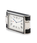
To put it another way, the dial has to work in harmony with the other elements of a watch. The Lange 1, for example, is a complicated dial encompassed in a simple round case. At the other end of the spectrum, Cartier is renowned as the master of sculptural, shaped cases. What's striking is that on many of these designs, be it a simple round Pasha or something as sophisticated as a Tank Asymétrique, the dial is pared back with restrained symmetry. The dial works in harmony with the case to form a singular aesthetic vision.


Some of Stigliani’s sketches for the Octo Finissimo range, courtesy of Bulgari.
The same can be said of some of Patek Phillipe's most charming, and challenging designs — watches such as the 3424, 3422 and the 3412. These elegant, sculptural cases are the Modernist-inspired vision of Gilbert Albert. Albert's distinctive shaped designs span several references and scores of variants, yet in every instance, the dials are comparatively simple. Base colours, minimalist hands and more often-than-not dials that are segmented into the 30-degree intervals that mark the passing hours. For all that Albert's cases express the spirit of the times, his dials demonstrate that there is also beauty in harmony and in purpose.

The Modernist silhouettes of Patek Philippe 3224s.
Symmetry and Asymmetry in dial design are important, but they're always part of a bigger picture. The case and the calibre have different but equally important roles to play in the overall design of a watch. What matters more than the placement of a date window, or the arrangement of indices is that each and every element works in harmony. If a watch design gets that balance right, that's when it sings.