


Five collectors choose their favourite date discs
There are very few complications, or features of a watch, that can be as divisive, yet seemingly as simple, as the date disc. Often blamed for disrupting the balance of a design, it can be on the receiving end of its unfair (and sometimes fair) share of criticism.
Despite the derision from some quarters of the collecting community, the date disc has been a favourite of watchmakers ever since its introduction by Rolex in 1945, with their inaugural Datejust model. Now, most models incorporate a date complication, almost by default.

Some say a date window can make or break a watch.
We wanted to step beyond the wide-ranging criticism of this design feature, by asking five collectors to tell us about a date disc, or window, that they love. Whether it be for the way the aperture is integrated into the dial or the typeface used, there are many different reasons to appreciate them. We left the defining criteria up to them.
Speaking with Lee Yuen-Rapati, Arthur Touchot, Brynn Wallner, Joël Laplace and Jaclyn Li, we were able to dive into what goes into making a great date complication. Drawing on such a wide variety of voices meant that we were able to look at a plethora of different windows, all with their own characteristic features. These range from the modern applications found at Audemars Piguet or F.P. Journe to the more obscure vintage offerings from Ernest Borel.
Lee Yuen-Rapati (@onehourwatch)
Perhaps better known in the community by his Instagram handle, @onehourwatch, Lee Yuen-Rapati is a designer with a Master’s degree in typeface design. In his spare time, he draws detailed watch sketches by hand, often imagining completely new designs. It may come as no surprise then, that when we asked him to consider his favourite date disc, the typeface used was a big factor in his decision.
Opting for a watch that has long received acclaim for its design credentials, Yuen-Rapati told us all about why he enjoys the Universal Genève Polerouter and its well thought through date and window.

The Polerouter came in many different styles but the date window stayed consistent throughout, courtesy of Shuck the Oyster.
“The date display found on Universal Genève Polerouters represents a subtle masterclass on thoughtful and elegant watch design. The foundational feature of this date display is its trapezoidal form. The date is surrounded by a thickly bevelled frame which helps to enlarge the aperture and adds more surfaces for light to interact with. The right edge of the window is curved to match the circumference of the chapter ring while the other three edges remain straight."

The trapezoidal date window of the Polerouter, coutesy of Bulang & Sons
“The combination of straight and curved lines is echoed in the typography of the date numerals. The top stroke of the 2 (and in the case of the 3, top and bottom strokes) resolves in a straight line rather than the common curved arc. The numerals are constructed with subtle, graceful curves, more reminiscent of Secession style lettering than grotesque or geometric sans serifs."

A date window that has been thoroughly thought through, courtesy of Bulang & Sons.
“The date disc uses three widths of numerals to consistently fill the aperture. 1–9 and 11 feature a wide width, 10, 12–19, 21, and 31 are medium width, while 20, 22–30 use narrow numerals. In addition to multiple widths, the numerals use a taller second digit from 10–31 in order to conform to the trapezoidal aperture.
Even single-digit numerals demonstrate this thoughtful detail: The top and bottom strokes of the 2 and 3 are not parallel, but taper inward towards the left side of the numeral. The numerals also employ many watch-specific typographic features such as micro-serifs to preserve the flat appearance of stroke ends, flat-top 4s, and open 6s and 9s.”
Arthur Touchot (@arthur_touchot)
The Head of Digital Strategy and a Specialist at Phillips auction house, Arthur Touchot has been a prominent member of the watch community for a number of years. In that time, he has been involved in some of the most significant auctions of the last few years and has helped elevate the auction house's digital presence. Prior to that, he served as the European Editor of HODINKEE, based out of London.
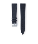
Touchot will be the first to confess that he is no fan of a date window, and his choice very much mirrors this. He appreciates them when they blend seamlessly into the dial design, which is why he opted for the small, but not insignificant, date window of the contemporary version of the Audemars Piguet Royal Oak.

Perhaps not the first watch you would think of when considering date windows as it blends in so well with the dial, courtesy of Hodinkee.
“I must admit I was a little surprised to be asked to weigh in on the subject of date windows... those who know me will also wonder why my opinion has been given any value, as I’ve never been their greatest advocate. But apparently that makes me an interesting candidate for this feature so here I am. Consider yourselves warned.
Putting aside personal opinions on design – dial symmetry and balance are important to me, and are usually sacrificed when dates are added – I can certainly see why there are some who love the complication, and why these are included so often by watchmakers in their favourite models. It is, without any doubt, one of the most useful features any watch can have.
I find myself using them all the time – that’s right, I actually own watches with date windows – and I must admit that while I sometimes check my phone to look up the time (a travesty, I know), I systematically go to my watch if I just want to check the date."


The dial texture allows this date window to fit in seamlessly.
“And that’s perhaps one of the reasons why the watch currently sitting on my wrist as I type these words is a Royal Oak – the current, mid-size Ref. 15450ST to be exact. There simply isn’t a time-only, no date Royal Oak in the current collection and there has almost never been since the original model was launched in 1972.
But that’s Ok!
The date window on the Royal Oak is so well incorporated into its dial that I often forget that it’s even there. At a glance, you might not even notice it, but I am relieved it is there any time I have to sign a contract for a PHILLIPS client because I’m absolutely horrible at knowing what day of the month it is.
Of course, there are many great date window designs, the Lange 1 and other watches that lean into the complication are excellent examples, but for those who aren’t massive fans, date windows work best when they blend in so well that you forget they’re even there... until you need them.”
Brynn Wallner (@dimepiece.co)
A relative newcomer to the world of watches and a growing presence on social media, Brynn Wallner is the driving force behind the increasingly popular site Dimepiece. In her own words, she's aiming to create a woman's comprehensive resource for high-end watches. On Instagram, Wallner has brought real attention to the watches that some women love to wear, by watch spotting female celebrities from recent and historic images.
As part of her website, Wallner has been interviewing female collectors about the timepieces they own. In the process, she fell in love with a Patek Philippe Nautilus ref. 4700 owned by one of her interviewees. This brief encounter was all she needed to spark a love for this specific date disc.
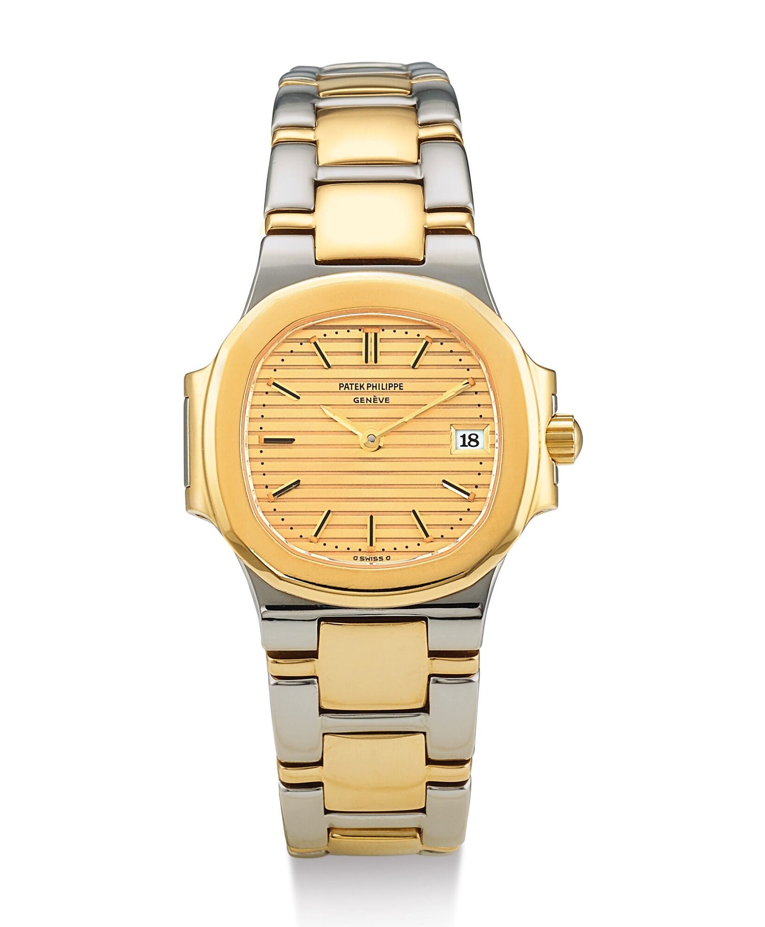

A smaller version of the classic luxury sports watch, courtesy of Sotheby’s.
“I’m relatively new to the watch world, but I’ve been lucky enough to make fast friends with some heavy-hitter collectors eager to share their goods with me. JJ Owens is one of those collectors. Our friendship recently went from internet-only to in real life at Sant Ambroeus on the Upper East Side, where I interviewed and shot her for my project DIMEPIECE.
She brought with her seven gorgeous timepieces for the shoot, including a two-tone, 26mm Patek Philippe Nautilus 4700. I’d actually never seen a 'ladies' Nautilus out of a glass box and on someone’s wrist before. Sometimes with the smaller watches, I think to myself: does it take away from the piece? Is it even worth it? Like, imagine if the Cartier Crash had a date disk interrupting the design flow... it’d be a literal train wreck (crash)."

Patek Philippe were always keen to show off the versatility of both the larger and smaller sizes.
“Anyway, back to the Nautilus. The date disc just works here. It’s understated but serves a purpose; it doesn’t take away from the watch’s lines, design and integrity. I also love how the white disc complements the champagne dial (whereas the black might feel too harsh).
"The disc’s font, too – it’s different from the Patek Philippe stamp – but there’s chemistry there. Having both a sans serif and serif work together is unusual, but, design-wise? It's a winning combination. Seeing how JJ wore this watch with such elegance and swagger… well, it was love at first sight. The sexy two-tone bracelet, that ‘70s energy, the date disc with that certain je ne sais quoi – ugh, I want it now.”
Joël Laplace (@jojolamontre)
A young Swiss collector with an eclectic taste and an eye for unique vintage designs, we knew Joël would have an interesting choice. It will only take a quick scroll through his Instagram page to illustrate this young man’s passion for the unusual horological creations of the past. Spending his weekends chasing vintage leather straps, Gay Frères bracelets and unusual timepieces in small flea markets throughout Switzerland, he has an eye for detail, to say the least.
For his selection, Laplace chose a watch that might not immediately spring to mind for many, but its date window is certainly an unforgettable and singular interpretation. The Ernest Borel Datopic presents a novel solution to magnifying the date window for those whose sight might be starting to fail them.

The Ernest Borel Datopic and its unique magnification date window, courtesy of Joël Laplace.
“A date disc or window that I particularly like combines two technical and aesthetic features. In March 1955, a patent was registered for the brand Ernest Borel based in Neuchâtel, for an optical lens set into the date aperture.
This particular invention was a strong commercial argument for the brand. Disregarding the mechanical aspect of the complication, the Ernest Borel Datoptic watch is especially distinguished by an optical lens set into the date aperture and held in place by a highly burnished ring."


The Datopic was sold around the world and managed to protect itself against copies with their own patent.
“One cannot help but think of the famous Rolex Cyclops lens. The patent for this remarkable invention was registered in May 1954. The Cyclops lens differs from the Datopic as it is placed outside of the watch crystal, over the date aperture, in order to magnify the date.
Interestingly, in 1955 Rolex informed their competitors in a press release:
‘To all watchmakers: we draw your attention to the fact that the watch crystal with the specially shaped magnifying lens is a Rolex exclusivity protected in Switzerland and abroad. We will not hesitate to instigate legal proceedings against any counterfeiting.’
Today, everyone has forgotten the Datoptic, but the Rolex Cylops lens is unmissable!”
Jaclyn Li (@a.dose.of.time)
Another young collector, Jaclyn Li is one part of the hosting team at The Waiting List podcast. With a clear sense of what she likes displayed on her ever-growing Instagram page, @a.dose.of.time, Li’s appreciation for great horological design from Cartier to vintage Patek Philippe shines through.
For her choice of date disc, Li went with one that defies many of the classical rules when it comes to dial design, favouring asymmetry over a perfectly balanced aesthetic. The F.P. Journe Octa range is far from the classical application of a date window, but she doesn't seem to think that's a bad thing.

The instantly recognisable layout of the F.P. Journe Octa Reserve de Mache.
"There is something captivating about the date window of an F.P. Journe Octa that makes me feel like I am peeking-out of an airplane window, or better yet, something much more otherworldly – perhaps the space pods from the planet Krypton. Looking from the outside in, while the non-traditional placement of the window is a refreshing juxtaposition to the standardised 3 o’clock window, it also accompanies the rest of the dial features surprisingly well.
One of my favourite details is the subtle curvature line in between the date discs. To me, it is an excellent reminder of the other “round” aspects of the dial, from the parking-meter like dial and sub-dial, to the crescent shaped end of the sub-second hand. I also enjoy quick-setting the date using the crown and watching the discs change one-by-one, something theatrical and fun."
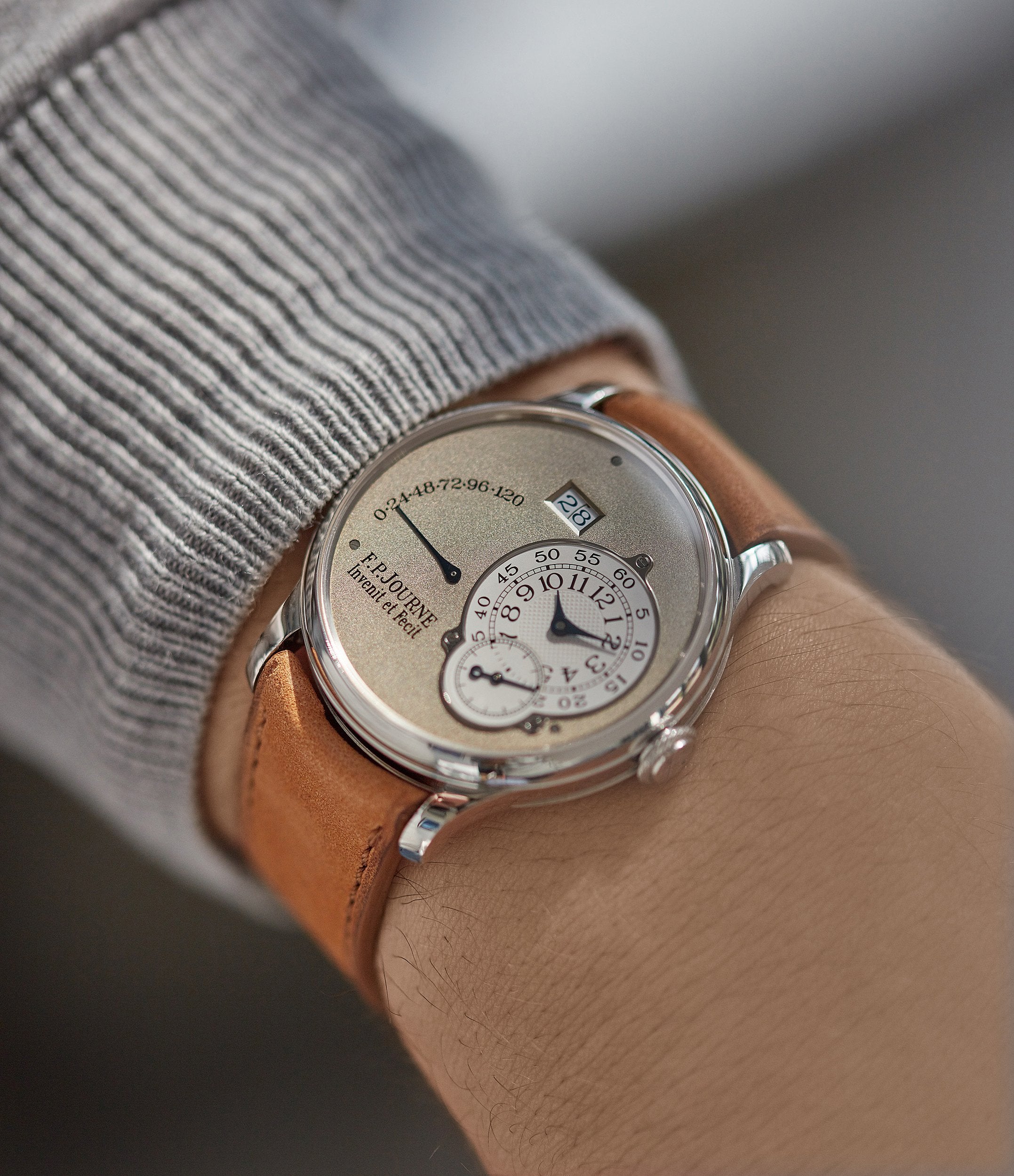

A large date window isn’t the easier complication to integrate into a movement without sacrificing slimness and proportion.
“But if I had to choose my favourite detail, it would be the blue text of the date disc. While it is subtle enough to not get noticed, as soon as the watch is out under bright sunlight, the blue numerals are what I notice first. Paired together with the blued hands and the shimmering gold dial, it is definitely a feast for the eyes."
Our thanks to Lee Yuen-Rapati, Arthur Touchot, Brynn Wallner, Joël Laplace and Jaclyn Li for contributing to this article and telling us all about their favourite date discs.