


The rise and fall of two-tone watches
Very few topics in the horological world are as polarising as two-tone watches. The mixing of different metals can be an instant turn off for many, while others see it as a fun and retro design choice. Hate them or love them, two-tone watches invariably generate strong emotions, with few people remaining indifferent.
The aversion of some is often either aesthetic, based on the idea that metals shouldn’t be mixed, or grounded in a rejection of the context they are associated with, namely Yuppies of a bygone era. The emotion behind the former has been around for a long time - for example, in heraldry, the rule of tincture has stated for quite some time, close to half a millennium in fact, that you should never have two different metals touching each other.
As for the context, the association with an ostentatious generation that popped up in the late 1970s through to the ‘80s is a curious one, which has over-shadowed bi-metal watches for years. Rather unfairly to the variety of two-tone designs and wearers, they often conjure up images of newly wealthy city traders, with their brightly coloured sports cars and over the top taste.

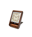
A 1940s rose gold and stainless steel Rolex Oyster, 1980s Patek Philippe Nautilus ref. 3800 and a Tudor Black Bay S&G that was introduced in 2018.
From retailing at twice the price of stainless-steel models at their peak, to now being shunned in favour of their mono-metallic alternatives, the rise and fall of two-tone is a story worth digging into. In this article, we hope to understand the history and context of these watches, from the earliest models in the 1920s to the golden era of ‘80s, as well as the reinvention and rediscovery of two-tone in a more modern context.
The history of two-tone
Despite a more recent association with a certain style of presentation, the history of these timepieces stretches back to the beginning of the century. Alex Ghotbi, Head of Watches for continental Europe and the Middle East at Phillips, is himself an enthusiast of earlier two-tone watches, especially those from Vacheron Constantin. He tells us that “we can see two-tone in pocket watches from before the 1920s. However, we really see them coming through in the Art Deco era.”
The first major name to start creating designs in this area was Rolex. Their long, rectangular Prince watches were some of the first wristwatches to get this bi-metal treatment. The diversity of the designs found within this range was indicative of the times. Indeed, the roaring ‘20s were responsible for disruption in a number of areas, from the fast-paced jazz music to the flapper aesthetic. To go along with this increasingly glitzy lifestyle and questioning of established norms, Rolex would mix colours on the cases of their watches, bringing an added sense of luxuriousness to their designs.

A Rolex Prince Brancard with a rose gold bezel (left), Rolex Prince "Railway" with white and yellow gold (centre) and a Rolex Prince "tigers stripe" yellow and white gold bezel (right).
You see a mix of gold types used in these models, with both yellow and rose being paired with white gold. Instead of the now more popular pairing of gold and steel, these cases blended two different colours of gold. This was all before the Great Depression and the Second World War, which would see the perception of flaunting wealth dip massively, leading to a generally more conservative approach from established brands.
However, during the ‘20s and into the ‘30s, the Rolex Prince came in all shapes and shades, with the most popular being the Brancard and Railway case designs. One of the more standout models was the ref. 971, which was adorned with a “tigers stipe” bezel. This rather exotic-sounding name referred to the alternating yellow and white gold stripes running the length of the watch, with white gold lugs flaring out from each corner. The “tiger stripe” model was very much a product of its time – we haven’t seen a similar design since then.
As we discussed in our article on Cartier of London recently, the city was the centre of an Empire at this time, with Rolex still being a London-based company. This could go some way to explaining the elaborate designs, as they would have supplied the well-to-do that passed through the city. The Railway Prince, so-called because of its visual similarity to the rapidly expanding railway network, was also a popular choice for adding a touch of gold. You can mainly find examples of yellow mixed with white gold, with a few rose gold examples known. Another piece that made use of the more unusual rose gold was the Prince Brancard, with examples known to have rose gold lugs that flare out from the case as they reach the strap.

Two Vacheron Constantin ref. 4072 from the 1940s in standard stainless steel and two-tone.
Carrying on this tradition of creative case design, and even taking it to another level, was Vacheron Constantin in the 1930s and ‘40s, especially with their chronographs. Ghotbi, who is an admirer of these early models, tells us “they were one of the first brands to be really creative with their case and lug design.” You can see this elegant and artistic approach in something like the reference 4178, which has particularly angular teardrop lugs.
Pair this with a two-tone look, where the main case is cast in stainless steel and the lugs, crown and pushers are all in pink gold, and it suddenly gives the watch a more distinctive presence. Ghotbi also points out that “at this time, watch brands didn’t hire designers. They had case makers who were tasked with creating what was in the catalogue and could then be asked to tweak a detail or alter a certain aspect of the watch’s look.” It is here, as we enter the war years, that we see the use of white gold in two-tone disappearing and it being replaced with the more utilitarian stainless steel.
According to Ghotbi, these chronographs were never made in large quantities and the two-tone versions possibly only represented about 10 per cent of the total production run, “although it is nearly impossible to be sure, as I don’t have the production figures.” He does believe that they still would have been rather popular at the time, due to Vacheron Constantin’s status as one of the biggest and most well-respected watch houses of that era.
Two-tone watches continued to be produced through the next 40 years, but they truly come into their own and saw a massive boom in popularity, in the 1980s. As many will be aware, this decade saw major socioeconomic change due to advances in technology and a worldwide move away from planned economies and towards laissez-faire capitalism. This went hand in hand with what many consider the golden era of two-tone timepieces, such that they have invariably come to be associated with this period.

A Patek Philippe catalogue from 1999.
During this time, we start to see yellow gold used on a range of models, either on its own or combined with steel. For example, it’s rather interesting that the Royal Oak and the Nautilus, both envisioned as luxury sports watches in steel, were also offered in yellow gold and two-tone, to better suit the tastes of the time. As outward displays of wealth were becoming more and more acceptable, the mixed metal was extremely popular with consumers, especially on watches which had bracelets, such as the two-tone Rolex Datejust, which has now become synonymous with the period.
To understand the prestige of two-tone during this time, one need look no further than the retail prices for some of these watches. As we outlined in our Collector’s Guide on the Nautilus 3800, a 1982 Patek Philippe price list from Germany shows a few interesting details. In steel, the reference cost 7,500DM ($3,000), whereas it was twice as expensive in two-tone, priced at 15,150DM ($6,060). Logically, gold was also then about the double of two-tone, priced at 29,950DM ($11,980).
The cost of materials, as well as the perceived value of gold, would no doubt have driven this rationale. However, it is rather surprising to look back on this today, when two-tone watches have sunk in popularity, mostly due to their strong association with this period, and the perception of stainless steel as the most desirable, understated metal. Indeed, the price difference between two-tone and steel has now reversed. On the secondary market for the Nautilus 3800, the two-tone examples now trade at half the value of steel. How the mighty have fallen.


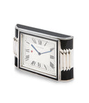
A two-tone Vacheron Constantin 222 and an Audemars Piguet Royal Oak ref 5402 in two-tone, both of which we handled recently.
Another interesting dynamic during this period is that between 1970 and 1980 the market value of gold went from an all-time low, to an all-time high. Though we’re purely speculating, the high value of gold could have been a factor in brands producing more two-tone watches, allowing them to add the precious metal to their timepieces, without incurring the cost of entirely encasing a calibre in gold. With such a high price for gold, it could also have made it increasingly desirable for those looking to show their new-found wealth. In a way, two-tone must have felt like the perfect balance between the preciousness of gold and the wearability of steel.
The desire for two-tone watches seems to subside by the time we reach the 1990s, with large chronographs and tool watches starting to dominate the market. Possibly in reaction to this, we start to see a new phase of two-tone. Having covered the earliest, eccentric forms of two-tone, then moving onto the apex of the mixed metal in the ‘80s, we now look at the reinvention of the concept in the last decade of the 20th century.

Three examples of Audemars Piguet's use of tantalum when paired with rose gold.
Spearheading this change was Audemars Piguet, which started playing around with and disrupting the concept of two-tone. The manufacture integrated new materials, such as dark grey Tantalum. An extremely hard metal to work with and corrosion resistant, when paired with stainless steel it creates a powerful, yet subtle effect, that Audemars Piguet put to great use in their Royal Oak collection. Unusually, they also paired it with rose gold, which once again offers an interesting and visually distinctive take on the idea of two-tone watches.
An Audemars Piguet advertisement from 1989 described the tantalum combination as “shimmering and resplendent in grey-blue with a contrast of gold that is simply unmatched and beautiful. The Audemars Piguet in tantalum: a privilege to possess it.” This legacy of inventive two-tone continues to this day, with Audemars Piguet offering a Royal Oak in titanium and platinum.

A plethora of two-tone advertisements, courtesy of @Adpatina.
Audemars Piguet also played around with the idea of “reverse” two-tone. Normally, gold is used more sparingly on two-tone watches, on areas such as the crown or the smaller links in the bracelet. The more visually rich metal is used to accentuate the design, while the core of the watch is usually made out of a white or dark metal, such as stainless steel. However, Audemars Piguet reversed this at times. For example, they created a perpetual calendar Royal Oak which is mainly cased in rose gold, with some details in platinum. The effect, though slightly confusing to the eye the first time, is rather powerful in its inventiveness.
One place where this move away from traditional two-tone watches wasn’t really felt was at Rolex. They kept on producing what is widely considered to be their most popular model to date, the ladies’ two-tone Datejust. Nowadays, brands are reaching back into their archives more than ever for design inspiration, whether it’s pilots’ watches based on the dirty dozen or classic dress watches from the mid-20th century. In the same vein, they are also starting to rediscover two-tone, as the combination has seemed increasingly attractive to consumers in the last few years. For example, Tudor have been heralded as leading the charge back to this multi-metal configuration with their S&G Black Bay models.
The cultural significance of two-tone
As we mentioned above, one of the most intriguing aspects of two-tone is the cultural context which surrounds it. Whereas the idea of timeless design is often celebrated and overused, there is a certain appeal to designs which are so clearly a product of their time – timeful design, if you will. Two-tone watches fit within that category, with a seemingly growing number of collectors coming to appreciate them, on account of their clear association with a period in time.
The link between two-tone and the Yuppie aesthetic has been hard one to shake off. As with all enduring cultural associations, the connection has been driven by Hollywood’s adoption of the idea. You only have to look at the book and subsequent film, American Psycho, where the protagonist Patrick Bateman, a Manhattan investment banker by day and serial killer by night, wears a two-tone Rolex Datejust. Written by Bret Eaton Ellis, the book is largely a critique of the shallow and vicious aspects of capitalism, with the characters being predominantly concerned with material gain and superficial appearances. In its association with Yuppie culture, few references feel as powerful and enduring as Bateman’s two-tone Datejust.
A curious side note, while in the book it is made clear that Bateman wears a Rolex, it is believed that the watch manufacture didn’t want any reference to their name in the film – for obvious reasons, we’d say. However, for the sake of coherence, Bateman wears a two-tone Datejust in the film.

Patrick Bateman embodying the two-tone psychology, courtesy of Universal Pictures.
Further perpetuating the image of a wealthy ‘80s businessman wearing a two-tone watch is Richard Gere’s portrayal of the rich playboy Edward Lewis in Pretty Woman, sporting another two-tone Rolex Datejust. These representations may not have done much good for the two-tone, given that neither are exactly stereotypical role models. However, this was part of the general perception of the man who would buy and wear a bi-metal watch in the ‘80s. This association has extended into other representations of the colourful, ostentatious world of the period, from the undercover police drama Miami Vice to Scorsese’s portrayal of the New York music scene in Vinyl.
As Phil Toledano, a collector of unusual watches and owner of three two-tone Rolexes, puts it “they give off a bit of a car salesman vibe.” This powerful association seemed to give the watch collecting community as a whole a selective amnesia; as everyone started to forget other examples of two-tone and disregard the category as a whole, on account of this more recent association. Toledano is a firm proponent of the earlier pieces, with all the two-tone watches in his collection dating to the ‘40s. While holding up a Rolex an early ref. 4500, he says “these pieces made in the 1940s are jewel-like.” This more refined, crafted approach to two-tone is what appeals to some about the earlier pieces.


Don Johnson was often spotted wearing a two-tone Datejust on set, courtesy of NBC Universal.
As for the later watches from around the ‘80s, it is precisely because they are a product of their time that some have started to enjoy them again, now that they feel distant enough from their original context. Toledano proves the point when. He says, “all you need to do is look at a certain watch and you just know instantly it was made in the 80s.” In many ways, wearing something which is far removed from the period or purpose it was originally intended for – such as a vintage dive watch in an urban context – can form part of the enjoyment with these.

The difference 40 years can make, a Patek Philippe ref. 1579/1 from 1943 in yellow gold and steel alongside a ref. 3770/1 from 1982.
Other times, the rationale behind wearing a two-tone watch just doesn’t have to matter. Some just like the way they look. One such example is Ted Gushue, the Editor-in-Chief of Type 7 magazine and owner of two two-tone sports watches. He says that now he only travels with two watches, “my two-tone 5402 and a steel and gold Submariner. I like to wear the Sub during the day when I’m at the beach and then change into my Royal Oak in the evening.”
While many think the connection between such watches and the young and rich of the 1980s is unavoidable, Gushue is less certain “I’ve never had any negative comments towards my watches when I wear them, and I’ve never heard any comparison to Yuppies either. I like to live my life very unapologetically and I think these watches show an elegant colour combination that match this.”


Gushue and his evening-wear, two-tone 5402.
Another appeal of two-tone pieces, if one is so inclined, is their relative accessibility in terms of price point, due to the way the market currently values them, relative to other metals. As Gushue puts it, “I love my Submariner because of the blue dial, which I think is the best blue they ever made. You can get the same blue on an all gold for $25,000, which is crazy, whereas I paid $7,500 for mine and it’s every bit as much watch.” Precisely because of their significantly lower popularity, they can offer an accessible entry point into some coveted references. Even Gushue realises that there has been some derision angled at these more colourful watches, “even back in 2010 having a two-tone watch was considered passé.” But are we now seeing attitudes change?
The future of two-tone
“Everything in the watch world moves in cycles”, Ghotbi tells us. Just as we’ve seen a re-appreciation in ‘70s style, Ghotbi believes that, with a little more widespread understanding of the era, the ‘80s designs will come back into fashion once again. If we look more generally at two-tone watches, the dislike seems to be waning somewhat over the last few years.
Indeed, modern manufacturers have slowly started leaning into two-tone, for the same reason that they have started re-issuing mid-century designs – customers are increasingly aware and appreciative of the idea of vintage. In a way, enough time has passed for the somewhat negative association of the ‘80s to either no longer matter to some or even gain a certain vintage charm for others. Others may just enjoy the novelty of two-tone.

Two modern interpretations for two-tone.
Tudor, the sister brand of Rolex, who have been doing two-tone in perpetuum, recently added what they call S&G models to their Black Bay and Chrono lines. What are widely considered as their flagship watches, are now sporting yellow centre links, crowns and detailing on the bezel and dial. In doing so, they are angling more towards the bolder ‘80s look than the subtle jewel-like ‘40s image.
However, the more subtle approach of the latter is also being brought back nowadays. Recently, Audemars Piguet recreated the design of a two-tone chronograph from 1940 with their [Re]master01. The caseband, lugs, and caseback are made out of stainless steel, while the bezel, crown, and pushers are made of pink gold. The distinctively vintage aesthetic of the piece, which received an enthusiastic reaction upon its release, suggests that the tide may be changing for two-tone watches.

A selection of colourful Datejust adverts courtesy of @Adpatina.
Mark Cho, the co-founder of The Armoury and an avid watch collector has always had a soft spot for two-tone watches. Considering his track record of narrowing down on certain types of watches which were largely ignored or maligned before being appreciated more widely, such as mid-size Nautilus and Royal Oak, getting his thoughts on two-tone appeared particularly compelling to us, especially as we try to understand if people might come to appreciate these in the future.
Breaking down his interest, Cho points out that he enjoys that these watches feel diverse, yet visually coherent. As he puts it, “My favourite thing about two-tone watches is how they allow for gold hands to stand out and shine against a mostly steel backdrop. While gold hands might look a little lonely on a steel watch, they feel very coherent and visually interesting with gold bezel and markers.” The vintage feel of these, which we felt might play into their growing appeal, also speaks to him. As he puts it, “I think the look of a two-tone watch is always a little old-fashioned, but in a good way.”


Cho demonstrating how to style a two-tone with the right shades.
Cho also questions one of the main critiques pointed at two-tone watches, namely that they are hard to wear and pair with clothing. He finds that it is quite the opposite, telling us that, “being a bit OCD, I prefer if all my hardware matches, i.e. belt buckle, buckle on shoes, ring, pen, etc. but with two-tone watches, I feel like either is ok, so in terms of colour, it's easier since you have both colours there.”
Regardless of the growing vintage perception of two-tone or the recent recreations which have appeared to capture the attention of collectors, only time will tell if two-tone will ascend to its former glory. From the whimsical Rolex watches of the ‘20s to the dramatic, flashy two-tone pieces of the ‘80s, two-tone watches and their context have been ever-changing.
The natural discomfort around mixing particular metals may keep putting many people off, while others may find these watches appealing – for the vintage aesthetic, far removed context or even just as a more accessible entry point into various iconic designs. In any case, what is certain is that people will always be in two minds about two-tone.
Our thanks to Alex Ghotbi, Phil Toledano, Ted Gushue and Mark Cho for lending us their time, knowledge and experience around this article. We'd also like to thank @Adpatina for supplying some visually rich vintage advertisements showing two-tone watches.