


Was the 1970s the decade design forgot?
The walls were a certain shade of green - avocado, they called it - with windows bookended with heavy dark velvet drapes. The L-shaped sofa was modular, in a crumpled brown leather, focused around a smoked glass coffee table, which stood on a shag pile rug, in cream. An armchair was upholstered in bright orange corduroy, next to a perspex magazine rack, typically laden down by the Grattan catalogue. On the wall, a huge mirror, over which was printed an Edwardian ad for Coca-Cola, and a reproduction of an L.S. Lowrie.
A sizeable cheese plant stood in one corner, overlooking a bank of white, brown-fascia units, from the late Terence Conran’s Habitat. On this was the turntable. Invariably next to this, as much for display as playing, it seemed, was Abba’s ‘Arrival’, the one in which the cover has the group crammed into the bubble glass cockpit of a helicopter. The year is 1976. This is the lounge in which I plan pincer movements with Action Man and watch ‘Space 1999’.

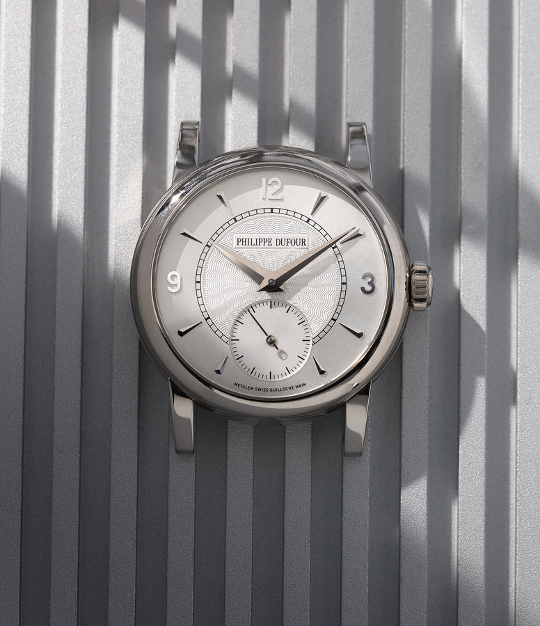
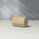
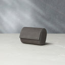
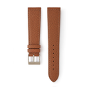
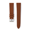
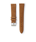
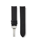
Nothing screams 70s more to a watch collector than a classic 3700, courtesy of @AdPatina.
It’s a cliche to describe the 1970s as ‘the decade that style forgot’, all flares and sideburns, garishness and grit. But, worse still, it’s inaccurate. The decade - as much as shifts in design thinking can neatly be packaged into decades - was, rather, one of an experimental energy and a largely unacknowledged radicalism, full of bold looks and, perhaps more importantly, bold ideas, from products to architecture to fashion.
“The problem, as far as perception goes, is that the 70s were sandwiched between the 60s, a period of utopian thinking, and the 1980s, ‘the designer decade’, when design became aspirational,” argues Penny Sparke, professor of design history at Kingston University and author of the forthcoming ‘Nature Inside - Plants and Flowers in the Modern Interior’ (Yale). “That can make the decade hard to grasp [from a design perspective]. Say ‘the 50s’ or ‘the 60s’ and people immediately know what is meant. ‘The 70s’, however, seem rather lost, because it was such a difficult, transitional but no less important period.”

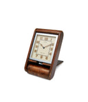
Not the writer's living room, but still very 70s.
Indeed, the social upheaval of the decade - the oil crisis, anti-war protests, polarisation between far right and far left, the fight for women’s rights, the Angry Brigade, high unemployment, in the US Watergate, in the UK the three day week, and so on - was arguably the genesis too for its characteristic readiness to look forward, as a form of escapism, and backwards too, for the same reason. And not least from the modernism that had evolved over the previous two decades, which came to be regarded - and still is - as the acme of ‘good taste’.
The 70s saw a young-spirited, post-war generation not simply kick against such prevailing mores, but finally in a position to define new ones. It’s why the decade can seem - to borrow another home style of the period - such a potpourri of approaches, with the post-modern butting up against the nostalgic, the playful with the intellectual, and all in search of originality.
“Sure, our perception of 70s design is shaped by the fact that the times were pretty grim - social unrest, an unstable economy, and a sense that the optimism of the 60s had proven to be optimistic,” adds Sparke. “But the fact is that many of the [design] ideas we take for granted now originated in the 1970s, albeit that they were not then yet fully formed.”

The individualistic style of David Bowie captured the feeling of the 70s better than anything.
Take individuality, for example. Less the collective style tribes of Teds and Mods, by the 70s the more eclectic one’s personal style, the better. From Bowie to McLaren/Westwood and punk, to the birth of the New Romantics, you made your own style. Literally - customising your Moroccan waistcoat was essential. The same went for home style - after modernism’s inherent conformity, the 70s went for personal expression through decoration, eclectic choices, a vision that looked to other, often Eastern cultures, as well as appreciated the new possibilities of pop colour, polyurethane foam and democratic, injection-moulded plastics. “Less is a bore,” as architect Robert Venturi quipped in response to Mies Van der Rohe’s ‘less is more’ dictum. It all added up to explain why Tom Wolfe dubbed the 1970s “the Me Decade”.
Rather than simplifying and streamlining, design looked to repurpose and reference, often in exaggerated form. Indeed, the idea of ‘retro’ too was a creation of the 1970s - the word was coined then - exploring as the decade did new takes on Victoriana, among other period styles. Barbara Hulanicki’s Biba, Mr. Freedom and other fashion-defining emporia looked to Art Deco, old Hollywood glamour and a deluxe version of the 50s - then well within living memory, of course - in order to make the dressing up box decadent again.
“It’s easy to look back and laugh at, say, Laura Ashley too now,” says Sparke of the ‘Little House on the Prairie’, New Rustic retailer that became a business phenomenon of the time. “But actually, what she did was incredibly clever. We think of it as lightweight when it was in fact innovative. And that’s true of a lot of design of those times.”

Not only were the cars different but the adverts for them were unmistakably 70s as well.
Certainly, it was shown, looking back could be looking forward at the same time. Thanks to the work of Italian design collective Studio Alchimia - alma mater of design heavyweights the likes of Ettore Sottsass and Alessandro Mendini - the later 1970s also gave us the anti-Bauhaus, anti-rational aesthetic of post-modernism. This nodded to historic and decorative details - let’s, as Philip Johnson proposed, put an ornamental pediment on top of New York’s AT&T Building - pushed the boundaries of form and then added bright colour or striking pattern to finish off a spectacular and often wryly-humorous building or piece of furniture. Graphic design could take the same approach too, plundering the past to produce new explosions of jagged lines and neon colours.
All of which can make 70s design sound superficial perhaps, merely an extension of its pop cultural love of the trashy, the camp and the kitsch. But the first explorations of sustainability were also a product of these years. The 70s saw the coming into influence of a generation of designers who were less interested in assisting the proliferation of consumer products as designing in a way that was beneficial to society at large.
“With a lot of canonical figures in design nearing the end of their lives towards the late 60s, and with the radicalisation of youth through the 1970s, design turned away from just producing beautiful objects and became more socially-oriented,” explains Jeremy Aynsley, professor of the history of design at Brighton University. “Design made this shift from being industry-oriented to taking a more intellectual position. It made a challenge to the status of modernism. The 70s were pretty grungy in many ways - look at punk, for example, which was important in design terms but which wasn’t product-oriented either. But it was driven by a sense that things had to and could change.”
With the dystopian tower blocks of the 60s, it was felt that architecture, for example, had become divorced from human needs and the environment, which saw the likes of Michele De Lucchi’s Cavart group explore the practical application of ideas - then largely still considered at best marginal, at worst crackpot - the likes of ecology. Not that this philosophy proclaimed any kind of retrograde movement, as earthy as it was - the same decade saw the advent of so-called ‘high tech’ style, the use of honest, long-lasting industrial materials, inexpensive in their price as much as their cost to the planet. It was an idea that shaped shop interiors and building exteriors, most famously with Richard Rogers’ Lloyds Building in London and Renzo Piano’s Pompidou Centre in Paris.
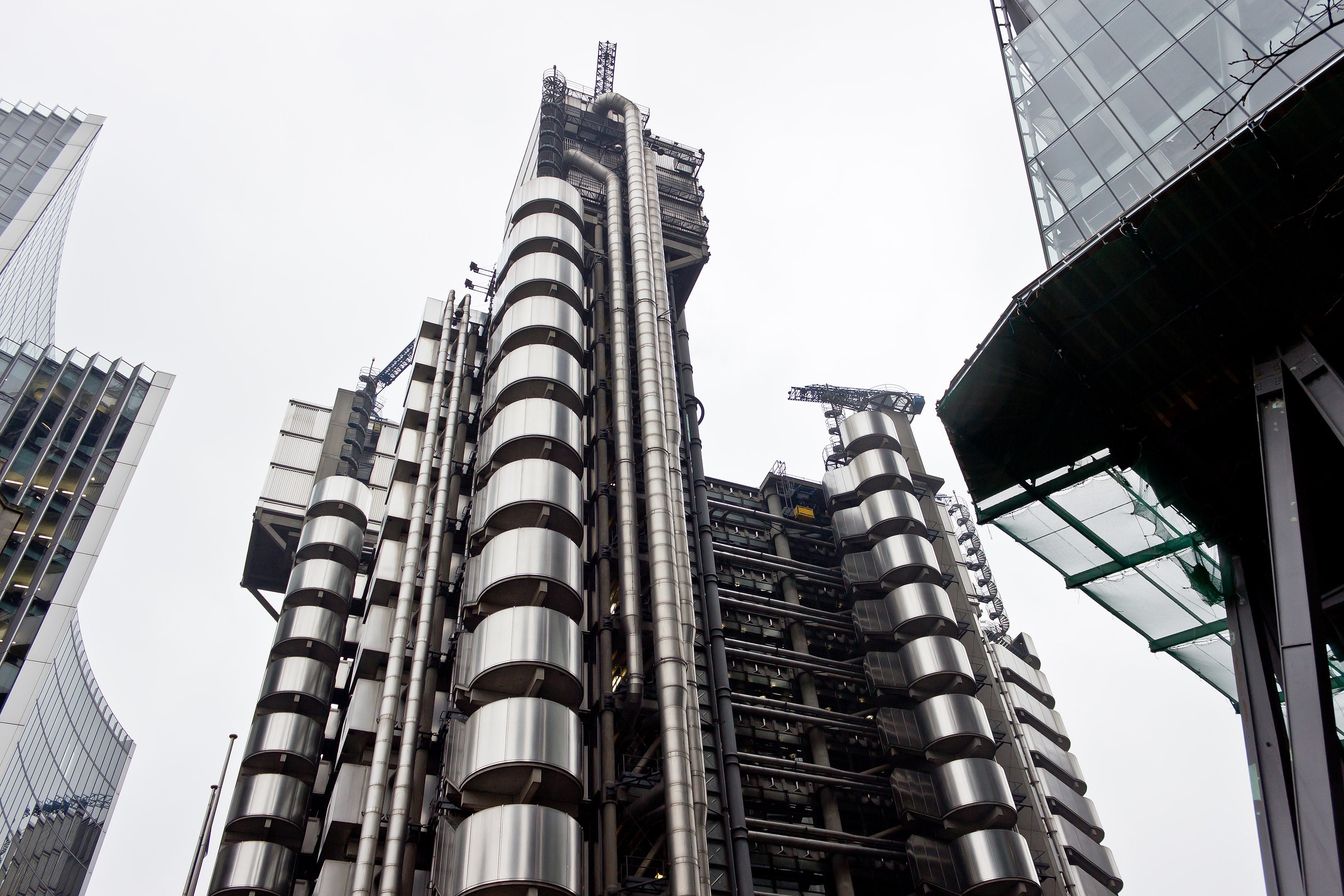
The exposed metal work of the Lloyd's building exterior.
It echoed in smaller ways too, all being part of a ‘back to nature’ inclination that saw the revival of craft-making, from glass-blowing and pot-throwing - re-appraised as being as much fine art as functional - to, as many a homemaker did, quilting the bedspread or knotting some macrame in which to hang all those house plants. If the hippies of the 60s talked about it, it was the progressives of the 70s that actually got on with it.
“Really it’s remarkable that, curatorially-speaking, when thinking about design, the 70s get so overlooked,” says Aynsley. “The Victoria & Albert Museum, for example, did a retrospective of modernism, and then of post-modernism, but entirely missed out the years in between out. It’s because the 70s are too often seen as the tail end of one phase in design or the embryonic phase of another. But so much of what followed benefited from what you might call this decade’s laboratory period.”
And what a laboratory period. A child, sat in their lounge, burying his toes in the shag pile, listening to ‘Money Money Money’ or wondering just how an atomic blast could really break the moon free of its orbit, would never have understood that exciting design didn’t lie in the future. Rather, he was, in fact, already living through a golden age of design - albeit one tinged with brown and avocado. The 70s, after all, was the era too of Concorde and Fiorucci, waterbeds and the Walkman, Space Invaders and the Pontiac Trans Am. It could hardly ever be described as forgettable.