


The History of A. Lange & Söhne Design with Anthony de Haas
By Russell Sheldrake
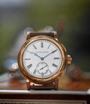
Throughout his tenure the brand has released some of its most creative, exciting, and unexpected models, including, but by no means limited to, the Zeitwerk, the Lumen pieces, and the sporty Odysseus. Not only has the catalogue grown, but their manufacture has as well, absorbing more talent that has allowed them to produce some of these unique pieces. De Haas talks us through the process of how they have grown their team, developed new ideas and discovered mistakes from the past. All of this is in the context of their latest release, the company’s first automatic chronograph, the Odysseus Chronograph.
Ninety percent of the time we are designing dial-side down. The only time it will go the other way is when you have a technical idea that you want to create, such as the Zeitwerk, for example.


de Haas says the dedication to mechanical innovation has driven the novelties A. Lange & Söhne has brought to market
When you first joined A. Lange & Söhne, did you feel that Blümlein and Reinhard Meis had handed you a clear design language?
Yes, it was very clear. Of course, Blümlein came in with a blank piece of paper with nothing but the ancient history of the brand. During the most important years of the development of the wristwatch, after the War and up until the 1960s, Lange didn’t exist, so we had no archive or attic to pull design inspiration from and do remakes. The genius of Blümlein was that he took the traditional elements, but he didn’t make something in the Baroque style; he made this perfect mixture of modernity and timelessness, with a very down-to-earth philosophy. The reason for this is that we know our watches are expensive, and we also know that we can only produce a certain number every year, so we didn’t want to jump on trends, we didn’t do 50 shades of green dials in the last two years, and this year we are only releasing this one watch.
We are very much watchmakers, so when I arrived in 2004 it was clear that a solid foundation had been made and my job was to carefully develop it. But I see my role as wider than this – not only are we trying to create watches, but we also need to develop knowledge given that we are a young company, with next year only being our 30th in the market. This is why we started different projects like chiming watches. This was never a tradition in Glashütte, but for me it was important that as a brand Lange has the knowledge to build these things. The same with enamel dials, and the [handcrafted] watches, even the Odysseus, which came from collectors asking for a Lange watch that they could wear on their holidays and jump in the pool with.
When designing a new model at Lange, are they all done dial-side down or would a movement be developed, and the aesthetics be designed to fit it?


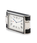
The back of a Lange 31, the first watch by the brand to have a remarkable 31 days of reserve. The back, while finished in a style traditional of German watchmaking, also features a keyhole paired with a turning key, that the wearer can use to generate significantly higher torque to manually wind up the twin mainspring barrel. The aesthetic of the face, dominated by the power reserve indicator, follows the main draw of the watch – its mechanics
Ninety percent of the time we are designing dial-side down. The only time it will go the other way is when you have a technical idea that you want to create, such as the Zeitwerk, for example. That was also a bit of fun for us, which is an important part of a luxury business – coming up with surprises. Another example of this is when we released the Grand Complication 10 years ago; it was a crazy piece with a Grande et Petite Sonnerie minute repeater. The next year, everyone was expecting us to scale that down, but instead we came up with a minute repeater 1850, a really classical watch. Two years later we came with the Zeitwerk, already integrated with a decimal repeater – a crazy, crazy piece. Even now, look at the Richard Lange repeater we introduced last year – a super-classical watch which we followed up this year with this sporty chronograph.
I will give impulses – that is my role, to stimulate and provoke – and then to let the rest of the synergies in the company come together.
When a lot of people think of the key elements of Lange design, asymmetrical features are often at the top of the list. The iconic sub-dial layout of the Lange 1 and the lower sub-dials found on the Datograph are examples that stand out. Were these design decisions that were passed on to the watchmakers to work around?
Not with the Datograph, no. The reason that has offset sub-dials is due to the outsized date window – there was no other position possible. Every new piece has a project book and the ideas for it start there and they are often very rough because we have a lot of creative people and I want to stimulate their creativity. This isn’t a one-man show; we have 55 people in development, that is 10% of employees at the Glashütte factory. So I will give impulses – that is my role, to stimulate and provoke – and then to let the rest of the synergies in the company come together. You can see this in a great way with the Lange 31 and how that led to the Zeitwerk. Without the remontoire being developed for the Lange 31, we would not have been able to come up with a solution for the Zeitwerk. Having this type of knowledge in house means that we are able to present a watch and then have it ready to produce pretty quickly.


Could you talk us through how a brand new project is started at Lange? Perhaps you could use the Odysseus project as an example, and walk us through that process from start to finish?
When I started in 2004, I was lucky enough to read through some of the archives and notes that Blümlein had left and one of them simply read ‘time steel’, or steel time, meaning one day he wanted to make something sporty and elegant. No sketches or anything – just this note. But at the time I had a lot of other priorities. At first, we only had two movement designers – now we have 10 – and we had to get started on the Lange 31, the Zeitwerk, the Grand Complication, and so on. So, you start working on these projects which all need time to develop so we spent the first few years on these projects and building up our team. Then when we had collectors coming to us asking for a sports watch. So, we had the Langematik automatic movement and we thought about putting this in a steel, sports watch case. You add crown protectors, big juicy hands, big markers, and then you have a sports watch. But we realised that was what everyone else does and not us. We could have also given the Datograph movement steroids and put that in a steel case, but that too felt wrong. Of course, you look at the Gérald Genta way, but that train had already left the station; we would have been conceived as copycats, so that was also off the table. It was soon becoming clear that this was going to be a difficult task, and looking back I can say it was my most difficult project I’ve ever worked on at Lange because there were so many things that could have gone wrong.


What started as a two-word directive from Günter Blümlein became the Odysseus. Now the brand has added a chronograph to their line of elegant sports watches.
I was lucky enough to read through some of the archives and notes that Blümlein had left and one of them simply read ‘time steel’, or steel time, meaning one day he wanted to make something sporty and elegant. No sketches or anything – just this note.
We really only had one chance to do this, and it is very natural to postpone these things. So, we had our first attempts in 2006 and 2007 and then again in 2009 with some kind of shaped case, but that was not going to work. But it wasn’t until 2012, 2013 that the idea of creating our very own face and identity for this watch was brought up. Easier said than done. Then we brought in this idea of having an outsized weekday and date, perhaps unconsciously bringing it over from the Zeitwerk – I don’t know. But then once we had it finalised, we realised we needed to add a chronograph to the family and we could not put the Datograph movement in there and so we had to challenge ourselves to make something different.
Recently, the collecting community has been obsessing over the small details found on early Lange models, and especially the early Lange 1s. One example of this is the difference between the big and small Made in Germany (MIG) signature on the dial. Is this something you have been aware of for a while?
We didn’t know anything about the MIG stuff until we had one brought in to be repaired and an accident happened during the repair, so we had to change the dial. After we gave the watch back, the collector said the MIG was not correct. We said, “MIG? What’s that?” and when the collector told us the difference in the MIG signature, we went back and realised that it was a mistake made by Lange. We were a young company and we wanted to use our Engravers MT typography, but the dial printers we used then said they could not do that typeface so small for the MIG and Doppelfederhaus printing. So they came up with something else and then years later – I think around 2001 or 2000; I don’t know exactly when – they said they were able to print the Engravers MT small enough. Naturally we said, “Wow – let’s do it.” It was only a couple of months ago that we learnt that we shouldn’t have done that.


The brand’s growing community of enthusiasts are seeking out pieces marked by small dial differences in typography, such as big and small “Made in Germany” marks. Until recently, even the brand wasn’t aware of some of these differences.
Change is something that we do all the time here. We changed the Lange 1 movement, for example, looking to optimise various parts of it and that is OK as long as it doesn’t change the identity of the design. Now we have learnt that if we are going to make a change such as this, we need to create a different reference or a new colour. It really was an accident that we only learnt about a few months ago and now we are working on reproducing that original print for the first MIG typeface as we now have the ability to print dials in-house. This means that if we get another of those old dials in again and it needs replacing, we can do it accurately.
Another area of Lange’s catalogue that has always stood out is the Handwerkskunst family. Could you explain how this originated and how you managed to work it naturally into what has always been quite an austere and Germanic design language?
The idea came from a very talented engraver of ours who used to do the balance cocks. She came to me one day in 2009 and said, “Tony, I have ideas. I can do better than just doing balance cocks.” So, I told her to show me as I love it when colleagues come to me with these kinds of ideas. She came back with a very extravagant hand engraving and initially I thought that doesn’t fit in our catalogue. But I don’t think it’s a good idea if a developer says no in advance; I should be open to ideas. Sometimes I need days or weeks to think it over, consider why it doesn’t fit and how it might be made to fit.


de Haas says he has used his remit at A. Lange & Söhne to let the abundant in-house talent and creativity at the brand flourish.
I like to think of fields in my work, and Handwerkskunst is just another field for us to explore. By giving it this separation, people might see it as a new interpretation of what we normally do here. After the launch, the same engraver came back to me and said that at home she had an oven and was experimenting with enamel – and that’s why in 2010 we started exploring enamel. It took a while to get that right. I’ve always enjoyed that I work at a company that allows us to take the money in hand and invest it in things like this. It means we are able to develop new ideas yet keep our identity secure.
We would like to thank Anthony de Haas for offering us insight into the design inspirations and process at A. Lange & Söhne and for showing us around the manufacture in Glashütte.


